As the Friends of The National Archives Research Fellow in Advanced Digital Methods, I spent last year working on data from Operation War Diary (OWD). OWD was a five-year collaboration between Zooniverse, Imperial War Museums and The National Archives. The project launched on the Zooniverse platform in 2014. It involved thousands of volunteers who annotated more than 900,000 documents from the WWI Unit War Diaries (WO 95), which documented everyday activities from the Western Front.
My work was to organise the data which came from the crowdsourcing, create a user-friendly dataset of these annotations, and also bring the history of the Western Front to life through interactive visualisations. Although the tasks seem clear and straightforward, I faced many challenges during the fellowship.
Challenges of data cleaning
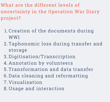
I encountered my first challenge during the data cleaning stage. I had to face a partially theoretical, partially practical question: How does one manage fuzziness, vagueness, uncertainty and ambiguity in crowdsourced data? In order to design a model to approach the uncertainty in the database, I defined some levels of uncertainty in my project (Fig.1).
My next task was to identify cases of ontological, statistical and epistemic uncertainties during the acquisition, transformation and visualisation of the OWD data. I know this jargon sounds difficult to grasp, but it is not as complicated as it seems. Ontological errors mean those pieces of information which you can never fully know; statistical means those unavoidable errors that you can quantify using probability; and finally, epistemic errors consist of those cases when you can actively mitigate errors in the dataset, such as correcting mistakes or lack of information.
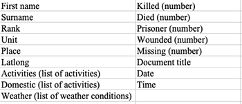
My next step was finding instances of reducible fuzziness in different stages of the project such as volunteer input, data transformation and cleaning and the presentation of visualisations. And finally, I could organise the data in a row-column structure, which enabled various uses of the dataset (Fig.2).
Challenges of visualisation
Even though I now had a model to understand the uncertainty in the dataset, and had developed a method of cleaning and organising the annotations, the visualisation stage brought more challenges to overcome.
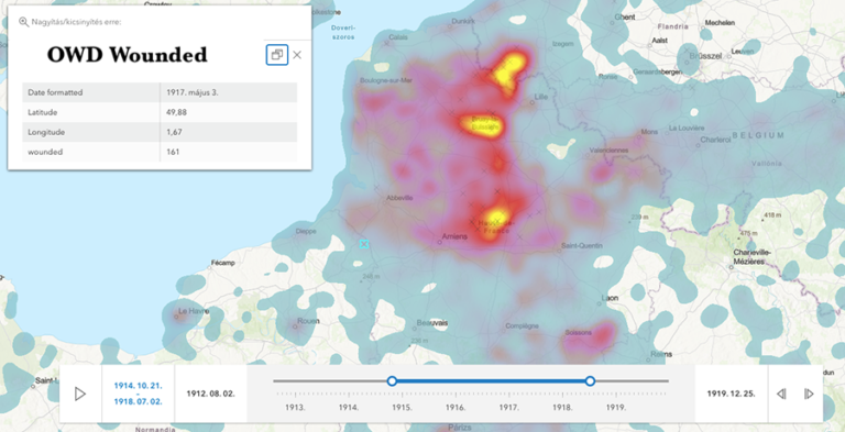
During the summer of 2021 I worked with placement student Nicola Hurt to visualise numeric data. First we mitigated errors in the place names to geo-reference the records, then experimented with visualisation possibilities.
The resulting maps show casualty statistics along a timeline on a map, allowing the user to switch between layers for each year. By clicking on the dots on the map, the user can reveal the information belonging to the given data point. If you are interested in this process, you can find the details in Nicola’s blog. I also experimented with other possible visualisations of the numbers, such as creating dynamic heat maps (Fig.3).
Challenges of working with crowdsourced data
These types of visualisations, however, revealed another challenging aspect of the OWD data: many of the annotations only provided primary information such as unit, date and time and people mentioned. There were options to input additional secondary information but these annotations were only made in a limited number of cases, restricting its statistical use. However, the volunteers did provide a wealth of interesting information when they used secondary tags on the Zooniverse ‘Talk’ forum to note and describe the records, highlighting information which can be used to bring life in the trenches closer to the reader. Although these tags (#story, #sketch, #animal, etc) were not initially exported from the Zooniverse platform, I was able to find them and combine them with the annotation data to create exciting visualisations.
Visualisation prototypes
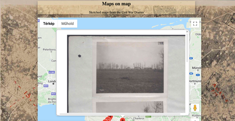
I designed two visualisation prototypes with the help of these secondary tags. The aim of the ‘Maps on map’ prototype (Fig. 4) was to make the sketches and maps drawn by the soldiers in WO 95 browsable through a present-day map of Europe. This way the landscape the WWI soldiers recorded on the Front could become comparable with the current landscape.
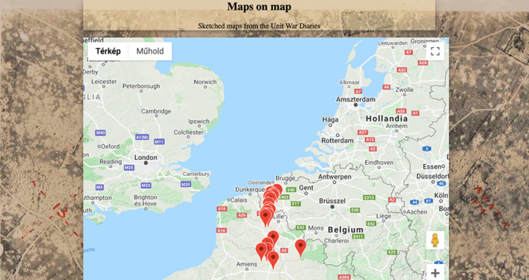
On the page, the user finds a map focused on Northern France, in front of an aerial photo background of the area. When the user zooms in, it reveals pins located on specific points on the map (Fig.4). Clicking on the pins opens the sketches created at the given location in a pop-up window (Fig. 5). These images also function as links to the original records, where the user can gain more information.
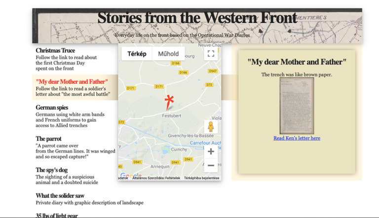
The ‘Stories from the Western Front’ prototype (Fig. 6) follows extraordinary events on the front while bringing the day-to-day life in the trenches closer to the user. For example, it shows where and how the Christmas Truce of 1914 happened, how German spies disguised themselves as French allies, and how British soldiers hitchhiked in a German car full of champagne. I aimed at a scrolling storyboard design which can link to the original documents. The user first encounters three interconnected panels: the left one contains the title and a shorter description of the event. The middle one shows a map, and the right one displays a thumbnail of the original document and more information on it. The three panels are interconnected: as the user scrolls down on the left-hand panel they move the pin on the map and display the relevant document. By clicking on the document thumbnail, the user can open the full document.
Further opportunities in OWD
Although my fellowship has now ended, there is still potential for more work to be done on the OWD data. This resource seems to be a constant source of research, creativity and engagement. I feel incredibly lucky that I could engage with this rich dataset in several ways.
By exploring the uncertainty in the data, I contributed to the theoretical angle of digital history projects. Secondly, by working closely with the dataset and revealing its complications, I have learnt about crucial elements that could inform the design of future crowdsourcing projects and make it easier to work with the data they produce. Finally, having the freedom to experiment with the visualisation of such an enormous collection was a once in a lifetime opportunity for a researcher, and for this I am immensely grateful to the Friends of The National Archives.
I hope to see my prototypes coming to life in the future, and to return valuable resources to the volunteers who invested time and energy to annotate the Unit War Diaries.
Absolutely fascinating – and just the kind of exploratory possibilities we hoped for when the Operation War Diary was in its very first stages of inception. It would be great to see these prototypes come to life.
It’s wonderful to see that the OWD data is still a source of interest and scholarship 9 years after the launch of the project! I was worked for Zooniverse at the time, and now serve as an assistant professor that University of Maryland’s College of Information Studies where I research the complexities of crowdsourced data through grant funded research. I’d love to know more about this project, and to know if the cleaned data or indeed any versions of the datasets from OWD have been published on National Archives discovery systems.