Why do we need a new catalogue management system?
Since 2019, we have been working on the creation of a new catalogue management system. If you want to follow our progress so far, you can watch our two presentations for Catalogue Week on YouTube here and here.
To many of the archive’s users, their introduction to the wealth of documents available at The National Archives is via our online catalogue, Discovery. This is the public face of the catalogue, with records related to over 25 million assets, both physical and digital, and an additional 11 million records related to items held at other archives around the country.
Behind the scenes however, the public catalogue is underpinned by an internal cataloguing system. This has grown over time to comprise multiple overlapping databases with complex interactions including duplication of data with different versions of the data feeding into different parts of the system. There are a number of projects currently in progress addressing different parts of the system with the over-arching goal of creating an improved, more efficient and more maintainable system to support the users’ needs more fully.
Project Omega is reinventing the internal catalogue and editorial process to help us reach our ambition of reinventing archival practice for the 21st century. The editorial process manages the addition of new records, corrections and other improvements. At the centre of the editorial process are ‘edit sets’. Edit sets are selected collections of records that are worked on together. They are used to share and distribute the work – for example between volunteers in a catalogue enhancement project – and allow record descriptions to be created, edited and checked by the editorial team, linked to authority terms (if appropriate) and finally, released to the Discovery team to be published as part of the public catalogue.
While cutting edge when it was designed over 20 years ago, the editorial application has reached what is known as ‘end-of-life’, meaning that it can no longer be actively updated. One consequence of this is that we cannot make any changes to improve usability or change the processes to reflect staff requirements. This has led to a number of features falling out of use or forcing staff to work less efficiently, making it harder for the teams to do their jobs.
Our need to replace the obsolete technology has given us the opportunity to revisit the possibilities offered by new technologies and marry those with new perspectives on archival description. This allows us to provide more context to our records and their relations to other records, to surface the many thousands of changes made to catalogue entries every year making our work more transparent, and provide a means to reveal hidden relationships and information through structuring our catalogue using linked data.
Our approach
The Government Digital Service (GDS) lays out a number of best practice recommendations for developing digital systems. The user and their needs are at the heart of these principles and, while we are not developing a public system, we are still building for users.
When we have presented previously, we have focused more on the underlying data structures and technological systems that we would need to support the new cataloguing system. This is because the interface that users see is just the tip of the iceberg in terms of what has to be built to make those pages work. The existing data (i.e. what you see in Discovery) needs to be extracted from the old SQL server database and transformed into our new data model, then loaded into a new data store in the cloud. For the data to be viewed and edited in the new pages and then saved back to the new data store, a number of new ‘services’ are needed to pass the data between the two. Verification is also needed to check that the data which the user enters is allowed according to the catalogue standards, for example, is the format of the covering dates correct, as otherwise they cannot be searched.
In line with GDS guidelines, however, we have been working to bring users – the internal staff members who will be working with the new system – to the forefront of our work. Since we presented on the project for last year’s Catalogue Week, we have worked with user researchers and interface designers to bring the new catalogue service to life. We are following an Agile approach to developing the new service which means we are building the service in ‘iterations’. Each iteration will build on its predecessor and each will be tested with users to ensure that it meets their needs as we progress.
Focusing on user needs
Between November and May, we worked with a user researcher and interaction designer to design a series of screens for the new system. These designs followed an investigation into current ways of working, trouble areas or ‘pain points’ and what the internal audience, drawn from a range of teams, wanted from the new system to support their working practices.
Designs for core pages in the interface were presented to the users through interactive screens (prototypes), giving a taste of how they might behave when they were fully developed. Based on feedback, these designs were changed and new ideas tried to see how users responded to different presentations of information or interaction options.
Among the first parts of the interface we designed and tested were:
- User dashboard – showing all the work currently assigned to a user organised by edit set
- The edit set view – an ‘edit set’ is the term we use to describe the container in which a set of catalogue entries are grouped to be worked on
- The ‘edit record’ page – the page where a user can see all the data about a record divided into specific fields including ‘Scope and content’ – labelled as ‘Description’ on Discovery, ‘Covering dates’, ‘Former reference’, ‘Legal status’ etc. On this page, the user will be able to amend, add or delete specific data for that record
Accessibility is an important consideration when designing new digital systems. There are international standards for accessibility which government projects are expected to meet. With internal projects, there is more leeway for how those standards are met but there is still best practice and it is important to adopt this wherever possible.
The first iteration
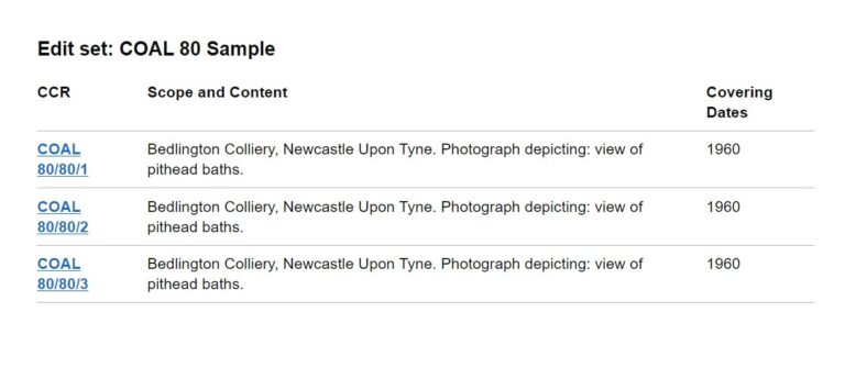
The first iteration represents the first slice of end-to-end functionality: accessing the system, selecting a record, editing the record, and saving those changes back for future access. Since records are edited within edit sets we are simulating the edit set environment and within that simulated edit set is a selected list of records with their key fields: the CCR (or ‘Classic Catalogue Reference’ as used on Discovery), the Scope and content (displayed under ‘Description’ on Discovery) and the record’s Covering Dates. The page has been reduced to the essentials needed to ensure we get the basics right before we add more sophisticated features.
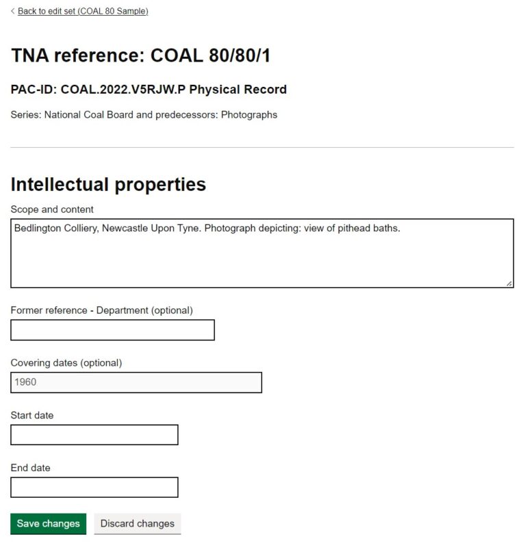
From the list of records available in the edit set, records can be selected and their details displayed. Similarly, we have kept the edit record page very simple for the first iteration, limiting the number of fields that can be viewed to just five and only two of those. (Scope and content and Former reference (Department) can be edited). This is to prioritise probably the most important field (the description) and to test a free text field.
Within our catalogue, different fields are managed in different ways. Many use a controlled vocabulary of terms. Others, like dates, require very specific characters and formats, and others require mark-up (the Scope and content in later iterations) and some are ‘free text’ i.e. the user can add any text they like. The fields selected for the first iteration represent the least necessary to make the record conceptually recognisable to the archivists as a record and the two fields that we are making editable we are treating as plain text. In later iterations, we will expand the types of fields supported until all the information that makes up a record is displayed, and editable.
From first designs to the first iteration
With the first set of designs created, the focus was on how to support the eventual complexity, and multiplicity, of tasks that the new system would have to make available to users. As we started to build the first iterations, the focus has been on creating the minimum amount necessary to deliver an end-to-end result. Part of this process has involved paring back the designs to the essential components delivered with the minimum technology.
A web page consists of a number of components – there are processes that run on the server that delivers the webpage, components that make up the web page and processes that run in the user’s system. The processes that run on the user-side can be affected by the browser, or other application, which is used to access the web page and other choices made by the user. To ensure that the system is accessible to the widest range of people, it is not advisable to rely on this user-side scripting – although it can be used to enhance the user experience. This approach is known as ‘progressive enhancement’.
Part of the reason we are delivering a minimal version first is to allow us to start with the most accessible version of the site. The ‘toolkit’ we are using to build these initial pages was designed by the GDS to support progressive enhancement and, as such, is one of the most accessible options available. As part of the development in these early stages, we will be reflecting on these choices and how we can increase the system’s functionality to match the complex interactions users will need to perform efficiently.
Example 1: The edit set page
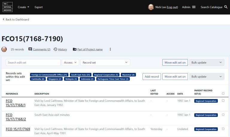
Below is a draft design of the edit set view page showing a list of records in an edit set. This screenshot shows the complexity we will eventually have to incorporate into the page including the contextual groups the records are associated with, the ability to add more records, or make changes across multiple records and move the edit set to a different stage in the process.

The page design reflects the move away from depicting the traditional archival hierarchy, as embodied in ISAD(G), in favour of the RIC-CM style record and record set model. The lack of explicit hierarchy did not test well with users and alternate designs were presented to users to gauge their reactions. However, since our first iteration is not concerned with this aspect of the page, it was not necessary to include it initially. Further testing of this part of the design with users will be carried out in a future iteration where we start to bring record set data into the system.
For the first iteration, a stripped down version of the page above was created, using the GDS toolkit. This version of the page only included the elements that would be supported in this first slice of functionality.

Example 2: The record details page
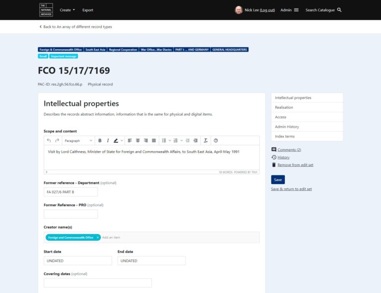
The record details page is the keystone of the first iteration as this is where the user is able to see and edit information about the record. The original design, part of which is shown below, was an information-heavy page divided into different sections.

As with the previous example, we have cut down the information displayed on the page to a minimum. The focus in this design is on the fields which can be edited i.e. the Scope and content and the Former reference, and those that are read-only: the date fields.

These designs and some of the information you can see (for example the format of the PAC-ID – a unique and persistent identifier not only for all records but also for all versions of record descriptions) have yet to be determined, as our new data model and its implementation are still a work in progress.
Future iterations
Once this ‘slice’ through all the data stores, servers, APIs and web pages has been tested and approved by users, we will work on the second iteration. This will focus on the creation, population and deletion of edit sets.
A future iteration will introduce the editorial workflow in which each edit set goes through a series of stages where the descriptions are edited, checked and finally released to Discovery. After that, we will introduce the functionality to edit record sets (the groupings that represent what we currently think of as the higher levels of the hierarchy such as departments, series and pieces). And after that the addition of authority terms (brief summary information about the creators or other individuals or organisations associated with the records), and then the mechanisms for sharing information with the other systems within The National Archives. Each of these will be reviewed to determine if we can improve them in a way that makes the work easier and more efficient, perhaps by introducing automation or validation so that staff can spend more of their time using the expertise and skills we cannot program.
Conclusion
Clearly there is a huge amount of work still to do but we are thrilled that we will soon have a ‘slice’ of the whole system working that we can test with users. We are looking forward to adding more and more functionality to realise our ambitions of reinventing archival practice for the 21st century.
What’s the name of this AI complemented app and where do I go to get it (Google play store? )
Thank you for your interest in Project Omega. The blog does not mention an AI app so please can you let us know what you are referring to? Thanks.