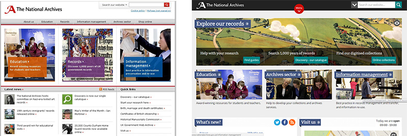
In 2013, we started an ambitious redesign of our website. Since then, we’ve been collecting feedback from users and discovered that there are improvements we could make to our homepage.
We have a lot of content on our homepage. As more people are accessing our website by tablets, mobiles and other devices than ever before, it’s important that we take a look at how it functions across a broad range of technologies to make sure that we’re not making users scroll through content that is not helpful to them. For example, do users still need a map of the Kew site on the homepage? Or do shifts in the way that people plan journeys to The National Archives mean we should remove it? This is one example of how we felt our homepage might contain content that doesn’t reflect the needs of users in 2017.
We also found that users weren’t able to easily find information about our projects and events programmes through the homepage. This is because our new engagement plans (see our Archives Inspire plans and What’s On programme for more information on what’s been happening) were launched after we redesigned the homepage in 2013.

The National Archives’ homepage in 2013 (left image) and in 2016 (right image)
The homepage redesign process
In September 2016 we decided to test our assumptions about the homepage by conducting research. We examined our website analytics, conducted surveys and went out to new and existing users to gather feedback. We also spent lots of time talking to internal departments to identify their problems and needs, and gather insight into their interactions with users.
Here are some of the main points that were raised:
- The design is busy – there are too many colours, styles and icons to be able to easily locate what you want, and it’s also not clear what most of the imagery aims to achieve
- The homepage doesn’t make The National Archives’ purpose clear, nor communicate that it’s open to the public and is free to visit
- Our onsite events, talks and exhibitions aren’t easy to locate
Armed with our feedback, we built prototypes to fix the problems outlined above, and we tested them with users and internal departments. Then we collected feedback and reiterated the designs until we arrived at a solution we felt was ready to present to our users for feedback.
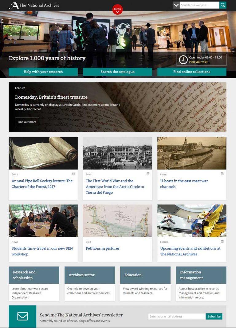
The new homepage design now provides better visibility to our talks, exhibitions and events as well as online resources and content such as blogs and podcasts. We’ve removed that wasn’t been used, rephrased titles to help users find things more easily, and relocated the more frequently accessed elements of our homepage to the places where users expect to find them. For example, information about our location and opening times, and our social media channels, can now be found in the footer, as this is where most users frequently scrolled to when asked to find them.
We’ve published a working version of the new homepage design as we’d really like to gather your feedback before it goes live. Please take a look and let us know what you think – there is a short survey at the top of the page. We look forward to hearing your thoughts!

The National Archives’ homepage in 2017, in BETA