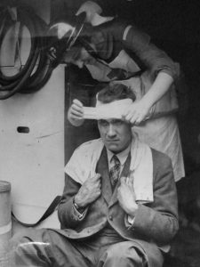
- The home front in black and white: a survivor of an air raid receives first aid, Aldwych, central London, 30 June 1944. (From a photograph album with the document reference AIR 20/6185)
Luxury is not a word that naturally springs to mind when we think about the Second World War, but last month I went to a fascinating lecture that connected these two topics. Design historian Neil Taylor’s talk, which formed part of the Archives for London seminar series, offered a thought-provoking insight into the place of luxury goods in the UK’s wartime economy.
I was struck by Neil’s observation that the black and white photographs of the period encourage us to think of the ‘home front’ as drab and grey, when the truth was rather more complicated. For many of the economic and social elite, life remained rather colourful. The onset of war actually opened up new luxury markets. (My favourite example was a crocodile-skin gas mask box!) In later years, rationing and the ‘make-do and mend’ spirit encouraged a brisk trade in high-quality second-hand furniture and clothing. A little luxury certainly helped to boost the morale of those who could afford it.
Although most wartime industry was given over to munitions or essential goods, a small trade in manufacturing and selling luxury items, such as silk scarves, continued throughout the war. Most of these were intended for the export market, particularly to the USA. The government encouraged this small-scale export of luxury items because it made wealthy Americans more likely to think of Britain and use their influence support its cause.
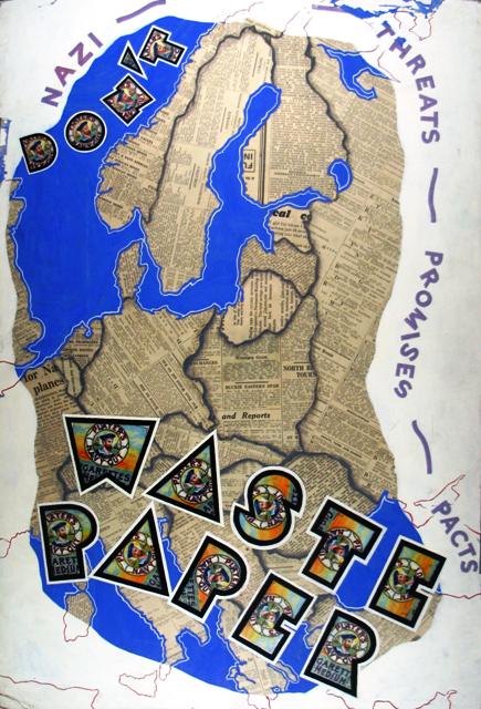
I’m using this as an excuse for talking about one of my favourite records. The map below is one of a series of pieces of artwork commissioned by the Ministry of Information for use in wartime publicity campaigns.
‘Don’t waste paper’: original artwork for a Ministry of Information poster with a stylised map design. (Document reference INF 3/204)
This particular example is a skilful collage made of newspaper and cigarette packets as well as paint. In an era when smoking was far more common, the logo of Player’s Navy Cut – used to form the letters of ‘Don’t waste paper’ – would have been instantly recognisable.
Also instantly recognisable is the shape of Europe. This is true despite the fact that the map shows no placenames In fact, it shows very little except international boundaries, many of which have changed in the 70 or so years since the map was produced. Even these boundaries are rather simplified – so much so that Luxembourg and East Prussia (an exclave of Germany separated from the main part of the country by the ‘Polish Corridor’) are not shown at all.
Like many designers and marketeers, the artist has been quick to recognise and exploit the power of the cartographic image. Yet, in another sense, the design was unsuccessful as it was never used in a campaign. I have not found any related records explaining why it was thought to be unsuitable but the reasons are not hard to imagine. For one thing, the slogan is rather weak, especially when compared to the famous ‘Dig for victory’ and ‘Careless talk costs lives’.
Perhaps more importantly, although the map design is both clever and striking, it is not quite right for the message it’s trying to convey. Although intended for a British audience, the map shows Great Britain pushed to the sidelines, just squeezed in at the western edge. As it shows pre-war boundaries (as of about 1938) and highlights the threat posed by Nazi regime to Germany’s neighbours, it would have begun to look out of date as that threat because a reality. (We don’t know exactly when this design was produced, but it makes sense to suggest that it dates from near the beginning of the war.) The connection between events taking place abroad and the need to conserve resources at home is too vague – or too vaguely expressed – to be persuasive.
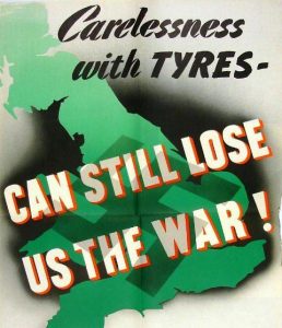
A map of the UK or the British Empire would have been a more effective way of persuading the British public to use resources wisely. Although the map-like background of the poster below is far cruder – and to my mind comparatively unattractive and uninteresting – this design was evidently more fit for purpose as it was actually used in a government information campaign.
Detail of a poster showing a more conventionally patriotic use of stylised mapping. (Document reference INF 13/288 number 18)
Many items that are colourful, beautiful or simply fun to look at were actually made for a serious purpose. Visually-striking items like maps and artworks can be just as much part of the official record as the files of typed or handwritten government papers. Just like the trade in ‘luxuries’, poster designs like these were a small but significant part of the wider, government-backed war effort.
What next?
View more wartime artwork in our online exhibition.
Listen to our Fashion or ration? and Kitchen front podcasts.
Start your own research by reading our guides on the Second World War home front and British propaganda.
Elsewhere on the web
Learn more about wartime experiences in Westminster from the West End at War website.
Watch clips from wartime films on the Moving History website.
Explore the Imperial War Museum’s Second World War collections.


I think it’s another point of view about the Second World War, it’s a focus about how they did represent it through black and white photographies, but I think they made it for the people see the horrible time that they were happening, however, in the comercial and educative context, the color in this material results interesting for the people and can do they want to learn more about the topic
Thank you for your comment, Meli. I’m glad you enjoyed reading my post.
All contemporary accounts of London (and no doubt other war ravaged cities) comment on how dreary and dull the city was, particularly by 1944 and 1945, a position which really remained for a decade or perhaps even into the 1960s. No doubt the Ministry of Information’s messages in these posters was reinforced by the use of colour which must have appeared more vivid considering the drabness of their surroundings.
Thank you for your comment, Simon. I like the idea of the posters being splashes of colour among the drabness.
On Meli Perezes comment i really do think that she should spell colour properly.
She may not know english very well but i think she needs to learn it.
Great comments otherwise!!
Thanks for your comment Sandy, and we’re glad you’re enjoying the blog. We would ask you to respect our participation guidelines, which you can find in our moderation policy, of being respectful to others.
Colour (a bit like harbour) is spelt differently between English and American versions, i.e. in the UK we would say Pearl Harbour whereas it is Pearl Harbor and color is the correct spelling if you have learnt the American version.