
Hackney Archive at the Dalston CLR James Library
As you may have already noticed, The National Archives web team is currently redesigning the website. We’re really starting to get to the meat and bones of the redesign and we’ve recently been exploring how people navigate around the site and trying to understand what helps them get where they want to (for example, menus, breadcrumbs). Although this may sound a little dull when thinking about web design as a whole, getting this right is fundamental to people’s experience on our website. In fact, it can lead to some really interesting insights into how people use websites.
We’ve adapted the Government Digital Service design model and we are now in the ‘alpha’ phase of the redesign project meaning that we are starting to gather feedback by showing users the early designs and using that feedback to make changes. This idea is that as we design we can evaluate and then iterate at many different stages throughout the alpha phase. Doing it this way helps us ensure that what we do is as usable as possible. It’s all part of a wider methodology of User Centred Design.
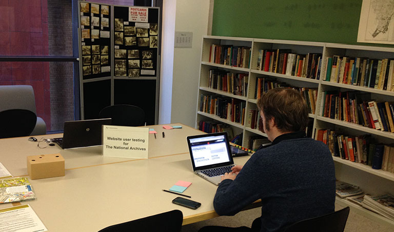
We’ve been testing some of the designs in our public reading rooms over the last few weeks, but we felt it was important to take things out of Kew. We wanted to carry out some user testing at another archive and Hackney, with its abundance of ‘pop-up’ restaurants and cafes, seemed the perfect location for our own ‘pop-up’ user testing. Hackney Archive very kindly allowed us to use their space to speak to their users for an afternoon and get some much needed feedback.
Steve setting up at Hackney Archive
Web designer Steve Mannion and I arrived at Hackney Archive with laptops and iPads in hand to speak to visitors. The focus was on how people navigate through websites and we wanted to observe how visitors got along with our prototype. Almost everyone we approached was happy to speak to us and give their views on the designs and we got some really useful insights. We sat down one-to-one with people, with whichever device they felt most comfortable using, and asked them to carry out certain tasks based around website navigation. We asked them to talk us through their experiences to explore some of their comments deeper.
As they spoke to us Steve and I were jotting down comments, issues and observations on our beloved Post It notes. Back in the office, we stick all the feedback together on a wall and begin to group all the issues together. This then helps us identify what we need to do to address the issues, iterate the prototype and go back for some more testing. This is the constant design cycle we have been going through to ensure that as we go through each stage of the project, we have made sure we have involved real users.
We find that this approach works really well in highlighting what is working well and not so well. The only downside is that my life has been overtaken by brightly coloured pieces of sticky paper, to the point that I have learnt the perfect way to peel one to ensure maximum stick and flushness to the wall.
It was great to be joined by our acting CEO, Clem Brohier, who came along to see first hand how people interact with the designs and also give us his own observations and thoughts. I should add that despite being our boss, Steve and I have ensured that all feedback on the day has been treated equally!
I would like to say a big thank you to the staff at Hackney Archive for allowing us to speak to them and their visitors. It was an invaluable day out in a very nice facility with extremely knowledgeable and friendly staff. I would also like to thank all the visitors who took the time to speak to us on the day.
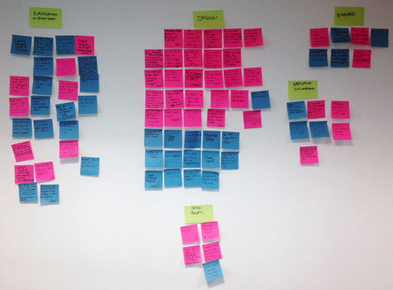
Ideas and comments on multicoloured post-it notes
What’s next?
Members of the web team will also be at Who Do You Think You Are Live at London Olympia on 21 and 22 February gathering further feedback for the redesign project, so if you’re there, look out for us and get involved! We’d love to speak to you.
After that, in March, we will be moving to the ‘beta’ phase, where the new designs will be open through the website for our users to explore. During this phase, we will do more extensive and in-depth testing with a representative audience to really explore the prototype in great detail and make sure that it is as usable as possible. The Information Management and the Education sections will be the first sections to be released. Once this has been done, we will begin to tackle the remaining parts of the website which will be released throughout the year, using the same approach.
After 37 years in IT, including 25 years as a Freelance Business Analyst, I just wanted to say that in my view, Discovery is the worst website I have ever encountered.
It is hard to navigate, hard to understand and very difficult to find what I am actually looking for. I follow links to what I think are the right pages and consistently find myself back where I started.
To say the site is frustrating is a massive understatement.
I trust the new site will be a significant improvement, but I am not holding my breath
Hi Stephen,
Thank you for your feedback. I’m sorry to hear that you have had a poor experience using Discovery. Would you be willing to speak to me over the phone so I can get a deeper understanding of the issues you have encountered?
The aim of the website redesign project is to remedy the exact problems that you mention; to improve navigation and make it easier for people to find what they are looking for on our website. We are working hard to get this right and we believe that involving our users in the process is key to getting it right.
Thanks,
Paul
I’m not sure whether what I’m looking at is the new design or not – but as of today (July 2014) it certainly needs redesigning.
Clickable areas are not clear resulting in time-wasting pointer trawling (guessing).
What’s wrong with “buttons”? (e.g. rounded, shaded, or rendered) – or underlined links.
On the other hand the little arrows, (white in a grey disc) which would be clickable elsewhere, here are not.
There’s too much (glaring) white space. The (few) grey areas are pale and dull.
While some websites have text that is too small, this has text larger than necessary – and too much empty space – meaning constant scrolling.
In summary, the experience is uncertain, cumbersome and does little to encourage a return visit.