Our website redesign launched just over a year ago and ever since we’ve continued to work on updating the site. It’s a big challenge and a long journey but we’re getting there!
Alongside these much needed changes we are developing a way of documenting the new design itself: a way of demonstrating how content should be arranged and displayed on screen. This will be a transparent and ultimately public guide, mainly for anyone involved in the production and maintenance of our sites. It will ensure standards are met visually (primarily user interface aspects) and in terms of accessibility (primarily user experience, or UX, aspects) as well as technically (based on W3C standards and best practices for optimisation of markup, scripts and code).
The design guide is essentially a big list of the different components that make up our sites and webpages, how they should appear and how they should behave. The idea is that with this guide to refer to we can avoid unintended inconsistencies in appearance and behaviour more easily. With so many people working on such a large website every day, visual consistency can be a problem.
A key part of the redesign’s aim was to ensure that the many sections of The National Archives website would have stronger visual and behavioural connections than they have done to date. This includes Discovery – our catalogue, our core service sections, the Archives Media Player and this blog itself. As each of these sections are redesigned the amount they share in appearance and behaviour will increase. Cosmetic differences may well be restricted to any use of decorative imagery (banners and backgrounds) although variations in colour palette and typography are areas we are keen to explore further in accordance with accessibility guidelines.
So the point of the guide comes from the need to match the technical cohesion of these sections, all adopting a responsive ‘mobile-first’ behaviour, with a stronger aesthetic cohesion – a robust yet flexible, shared visual language. We would then manage certain aspects of each section’s visual identity, such as any use of decorative imagery, more effectively, with a greatly reduced chance of making that section look too different or detached from any other part of the site. Exceptions may occur where a section has a specific commercial purpose e.g. our image library or our bookshop – neither of which were developed entirely in-house.
The guide will be created, published and managed in the same way as the rest of our site, becoming a built-in manual sharing and following the rules it lays out.
As an example of a component, consider our logo. For the redesign we selected an entirely white version of the logo to appear on a dark grey band which constitutes the site header. But besides colour there are other considerations as to how the logo should appear, such as position on the page, dimensions on-screen, file size and format. The guide would contain a page on considerations for use of our logo online – not just at the top left of each webpage on our site, but all uses of it online. This information would then be immediately accessible and useful to any third party that required the use of our logo.
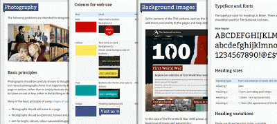
Glimpses of how our design guide is shaping up
The components and elements of content we intend to provide guidelines for so far are:
- Layouts: the header, the footer, the grid arrangements and tables
- Text and type: headings, body text, quotes and links
- Lists: bulleted information lists, bulleted navigation lists, alphanumerically ordered lists, dropdown lists and pictorial lists
- Dynamic elements: accordions, slideshows and carousels, navigational tools (eg. our ‘mega menu’, tabbed content)
- Forms: searches, option selection, commenting and their interactive elements (e.g. buttons)
- Images: photography, captioned images, images of our records, banners, backgrounds, thumbnails, icons, diagrams and visualisations, logos and branding
- Colours: core and custom palettes
In each case the aim is to provide explanations and evidence for why the elements appear and behave as they do. This involves a lot of time researching, discussing and naturally a little arguing on our part, but we always try to keep it constructive!
Our approach to this design guide has two particular sources of initial inspiration. One is the BBC’s Global Experience Language (GEL) which was published online several years ago. In their case the ‘GEL is the glue that ties all BBC services together’.
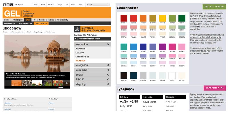
Left: The BBC’s Global Experience Language. Right: The Government Digital Service’s design principles
The other is the Government Digital Service’s design principles with a practical, holistic and transparent approach that we refer to in our own quest for quality and consistency (not uniformity) within the online work of our own organisation. The principles transcend any one organisation’s remit and are applicable across public services online and to much of the wider web.
As the look and feel of our new sites develop over time so too will the design guide with further research, exploration and feedback to provide evidence for our choices. It is something that should not just tell you what colour or height something is but also why. ‘Because it’s always been like that’, ‘because I saw it like that on another really cool site’ and ‘because that colour matches my umbrella’ are not answers we can accept if we want to achieve a higher standard of design – although they could be springboards for more substantial reasoning, and even present alternatives and suggestions for improvement.
The guide is still in progress but we will make sections of it available as soon as possible and we hope it proves useful to anyone working with The National Archives, anyone curious about our work or anyone curious about design.
[…] Introducing our online design guide […]
Great that you have done this. Just as long as you listen to users about what we hate or like most. If a grey or pastel font for instance is standard throughout and we show why this is bad for the more mature user then it can be changed throughout the site as part of the design standard?
Similarly mature users find it difficult to pick out salient items from screens with a large number of images so a switch to a less image rich look would also be reflected throughout the site?
As you know usability is my watchword.
The most annoying thing about the TNA site is not its appearance but the fact that every time I arrive on the site, it asks me if I’m happy about your cookie policy. How many times do I have to say Yes? Can’t you create a cookie so I don’t get asked about the cookie policy so often?
Hi Adrian,
Thanks for your comment. Ordinarily your browser should accept the cookie and not display the notification again until it expires or your browser’s cache is cleared. So it may be that your browser (or possibly your firewall/security software) is not set to remember cookies, and that is why you are being asked about the policy each time you visit our site.
Best wishes,
Alexa
Well like Adrian I get the cookie message all the time whatever browser or firewall I am using from tablet to pc to laptop.
Looks like it is a question of two or three hours trying to identify and undo the appropriate settings on all my devices or put up with it. So it is a case of putting up with it isn’t it? As Delia Smith I think once said “life’s too short to stuff a mushroom”.
Hi Jacqui,
Thanks for your comment. We do our best to ensure that we listen to our users throughout the design process and after. We adopt a process of User Centred Design (https://www.gov.uk/service-manual/user-centred-design) here at The National Archives and this involves a great deal of user research. At every level of the design process from start to post release, we try and incorporate feedback and observe how our users interact with what we’re designing. This is done through workshops, interviews, surveys and a great deal of user testing. We also feel it is very important that we are speaking to a representative set of the people who use our services when doing this. This is to ensure, as you point out, that whatever decisions we take, we have got evidence from our users to support. Also; it just makes sense to design something with the people that will be using it at the forefront.
We try to make our guidelines are flexible – for example our Information Management section has fewer images because there was a clear consensus during the user testing that they were not helpful.
We’ve written about this process in previous posts, which you might be interested in: http://blog.nationalarchives.gov.uk/blog/tag/website-re-design/
We do try our best to listen to what people like and don’t like but are always open to new ideas / suggestions. Would you like to have a chat about it the next time you’re in for UAG?
Regarding the cookies – we’ve notified It and they are looking into the problem so hopefully we can get that sorted.
Very nice work. I am currently working with an institution that is very similar to TNA in Canada. Can you tell us a little bit about the design team behind all this? How many people, their backgrounds, etc. Did you create a new “digital design” unit? Is there a dedicated UX team? So many questions 🙂 Thanks.
Thanks Jean-Francois, I am happy to answer your questions.
We are a Design Team of six working as part of a larger Web Team which includes Paul Lamey our dedicated UX Manager. Within the Design team itself we have Gwyn Jones our Lead Front-end Developer, Simon Wilkes our Senior Designer and three more Web Designer & Developers including myself.
Between us there is a strong degree of overlap in expertise around the areas of web development, user experience, UI design and more traditional aspects of visual design (a few of us will occasionally create video and print work too).
You can find out a bit more about the team and our work through previous blog posts tagged ‘website re-design’: http://blog.nationalarchives.gov.uk/blog/tag/website-re-design/
If there is anything else we can help you with please let us know.
Hello Steve,
I had forgotten about my question and just checked back today. Very helpful to know that you have a dedicated design team within a larger web team. Unfortunately, we are not there yet, but you are definitely showing the way. Thanks again.
Hi Paul
A chat would be nice. The next meeting is 16 Dec. Before is probably best.
However I must give you all credit for listening to us at User Advisory Group. Discovery is improving all the time thanks to user comments.
I have been struggling to make certain subscription website screenshots visible when projected for a beginners family history day course to show them how to search. This website is mainly greeny brown and when I changed my windows accessibility setting to white high contrast for the display it loses the search boxes. However a friend who is a volunteer IT Buddy for Tamworth library informs me that this is a bug in the Firefox browser but that it will work in IE.
I will give it a try and see how other websites look including yours but today I need to check my presention timings and mop up any issues ready for tomorrow. As always computer literacy levels will be variable hence the screenshots to talk them through it all before they get near the computers.
Jacqui
thanks for sharing this design.this is very informative and helpful for online design guide.
excellent work, This article is very informative and way to describe these guidelines is very easy to understand. from iafrica.tv
Very good help and guide for public.
i really appreciate you for providing this useful information. your method of describe is also very well. from 1000ftcables