I really hope you’re enjoying the sneak peak at the redesign of the Education section of The National Archives’ website. We’ve hopefully made these pages more visual and accessible, as well as showcasing the many images and historical documents available to students and teachers.

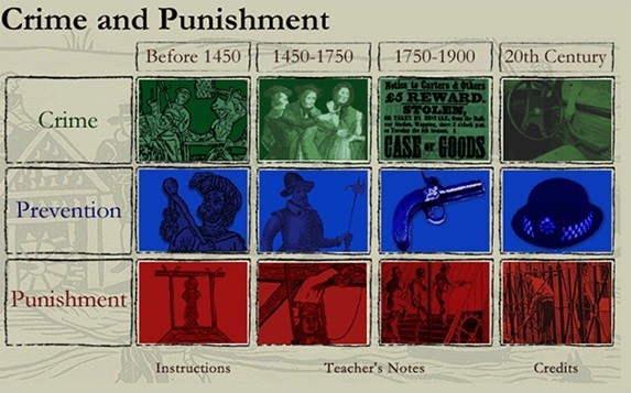
Crime and punishment microsite
We’re in the process of moving the Education site into WordPress and away from our previous content management system. It’s been a perfect opportunity to evaluate the way that we present the content, and improve the structure of the site. For example, we’ve had a chance to make our games, which have been tucked away in various parts of the site, more visible, by integrating them into the main structure of the site.
One of the challenges us designers faced when redesigning the Education section was how best to present the hundreds of resources in a way that would be both fun and functional. The free resources are grouped by time period, key stage and type, such as lessons, games and workshops. To add to the complexity resources often appear in more than one time period or key stage. We needed an intuitive way to present and filter this content.
For example take Crime and punishment. This popular microsite allows you to explore crime, prevention and punishment through the ages, from the medieval period through to the 20th century. That’s eight time periods and four key stages in total! Luckily the process of migrating content from the existing site to our new WordPress platform gave us the opportunity to group each individual resource through the magic of metadata. More specifically, tags.
So what are these tag things?
The best way to visualise tags is to imagine them as individual entries in an index, such as one you might find at the back of an encyclopaedia. If you look at the bottom of this post you can see the tags for this article. They are words and phrases related to this article, linking to similar articles that share similar themes. Therefore a tag is a descriptor. However, unlike broad categories such as ‘Education’ or ‘Records’, a tag establishes a discreet connection between different types of content.
One of most challenging aspects of the redesign, and the part which has caused the most discussion, is the use of labels on the Education site. We provide a large quantity of resources spanning 900 years, and we need to make our content as accessible as possible to teachers, who don’t have time to scour our site looking for the resources they need. How should we break down our content into easy to navigate sections? We’re testing labels such as Breadth study, Depth study, Showcase and Themed collection as ways of describing our microsites and other resources. What do you think about these terms? If you are a teacher or a student, please let us know!
One of the main improvements is that the site now responds to the filters that the user selects, so you can view on one page the resources relevant to you. Want to view all the Classroom resources relating to the Victorian period on one page? No problem.
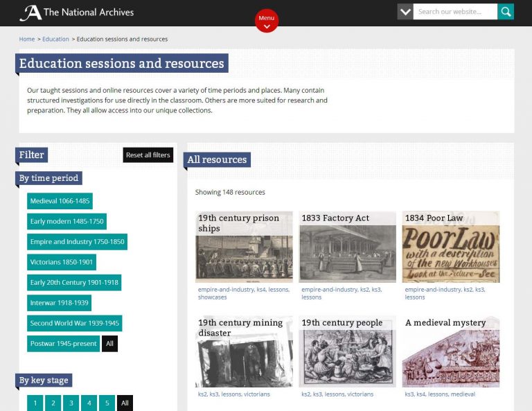
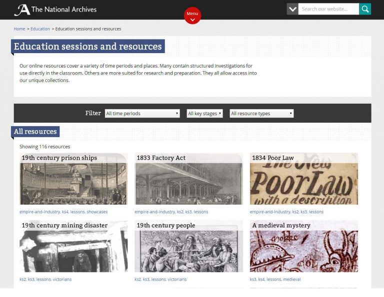
Below are the two designs the web design team explored. Both designs display resources in a visually similar way. However, the first design has all the options clearly laid out in the left-hand panel. The second has three drop downs, neatly containing all the available options – a layout better suited to tablet and mobile users. Initially we were unsure which would work best with our target audience.

Screenshot of the redesigned pages

Screenshot of the redesigned pages

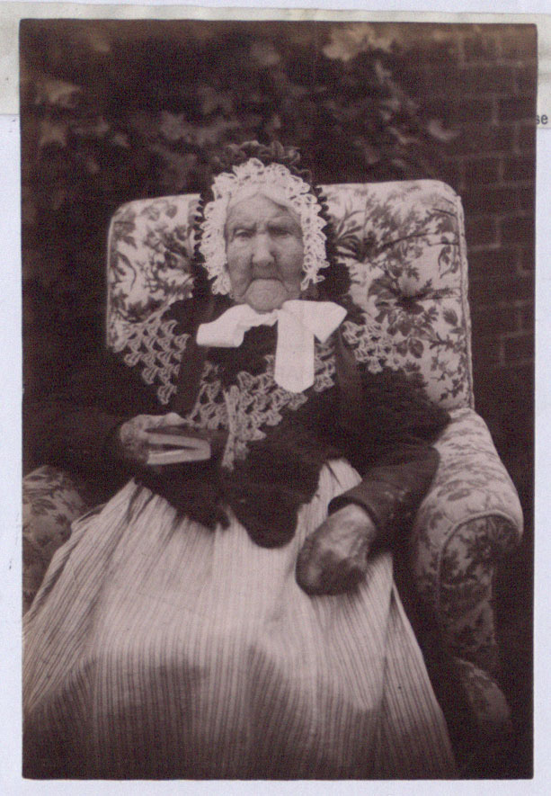
The Tickenhall centenarian – the Education site’s unofficial mascot
My colleague Maria Cieslak wrote a brilliant post about the importance of testing early. We showed both designs to pupils and teachers from schools who kindly volunteered to help us. The feedback from pupils and teachers gave us valuable insight into the level of experience of our visitors and helped us to make subtle design changes. Pupils had little issue with understanding the filters, mostly due to already being seasoned users of websites with similar features.
We’re also pleased with the way that good quality digital images of documents can now be viewed, in full, by visitors to the site. Previously users would often view a tiny image in a pop up browser window that was fiddly, or even impossible, to use on a tablet. Now, viewers can zoom into or view a full copy of our documents, and discover something about it for themselves. For example take Mrs Banton, The Tickenhall Centenarian, who has become an something of an unofficial mascot for the Education website. It’s now possible to view her in her entirety on tablets and smartboards, with no fiddly zooming required.
So where are we now? We’re still improving the resources page and the final version will likely incorporate the best elements of each design. Which one do you think works best? Let us know in the comments! Equally, if you have any feedback for the Webteam do let us know by completing the short survey.
