It’s been six months since we released the first pages of the new look for our website. On Monday, quietly, beta releases of our Education and Information management sections joined them. 1
Beta means that it won’t work perfectly – we know there are minor bugs and things we can improve on and we might take it offline to fix something – but it will generally be there for you to try out and let us know what you think. 2

Screenshot of beta site on desktop and mobile
Some things we learned from user testing
Although the content and audience for the Education and Information management services are very different, our user research established that their needs and behaviours share similar characteristics. First, they each want quick access to authoritative content, whether it’s advice on copyright or an interactive game to use in a lesson. Second, both audiences had a strong need for a better mobile experience. 17% of visits to Education last month were from mobile devices, with iPad by far the dominant device (55% of mobile visits). 28% of Information management visits are from a mobile device, but phones were more heavily used than tablets (38% of non-desktop visits were from iPhone) – a very different pattern to that seen elsewhere on the website.
Here’s a run-down of the main improvements:
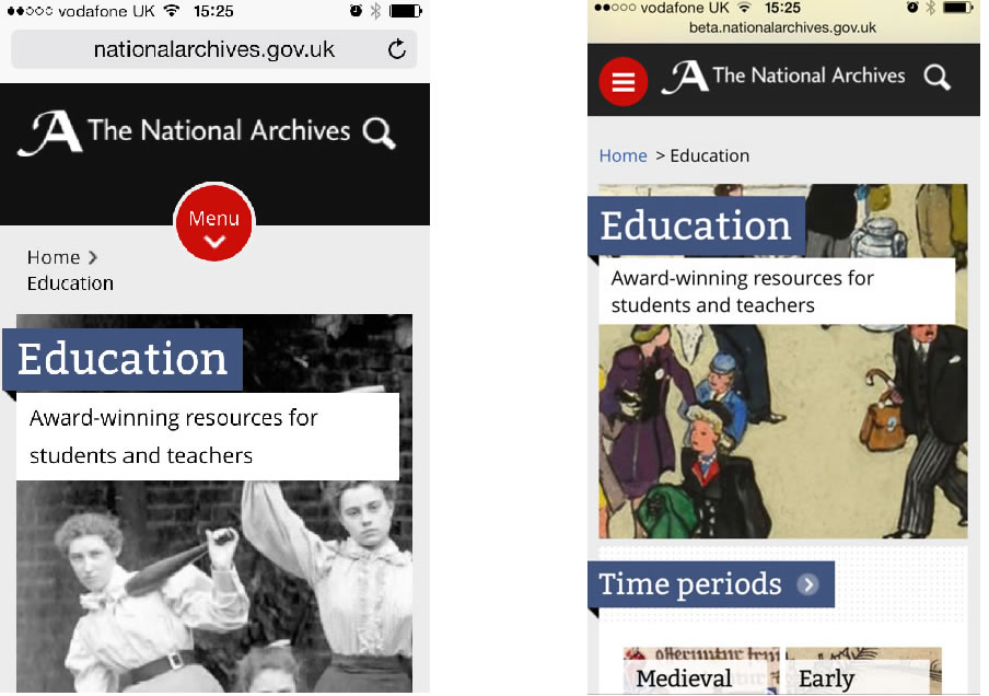
Improving how you navigate or browse through content
Research showed that people found the layout of information on our website overwhelming. We sketched out five alternative navigation methods and tested them on colleagues and users, with some surprising results. The left-hand menu was hindering rather than helping: it showed ‘siblings’ 3 of pages as well as ‘children’ 4– simply too much information, so we’ve stripped it back. As to whether the menu sat on the left or the right, people were generally agnostic; right was a marginal preference so we’ve gone with that. The breadcrumb was far more heavily used than we expected – we simply hadn’t appreciated how much people rely on it. We’ve made the breadcrumb larger and more prominent, particular on smaller screens.

Breadcrumb on mobile device
Mobile first
All our new pages are designed ‘mobile first’ and the content resizes itself depending on your screen size.
Quicker routes into our content
If you’re using either Education or Information management, there’s a strong chance you’re at work (or school) and are pushed for time. Speedy access to content is vital.
We’ve restructured, tested and refined the Information management section based around what you want or need to do. For example, we’ve done away with the current ‘Our services’/’Our projects and work’ divide to include more meaningful and explicit section titles such as ‘How to manage your information’.
We’re using keyword filters to index all our guidance. Over time, this will expand to include guidance in any format (not just PDF – in fact, considerably fewer PDFs) and the content of the guidance will soon be searchable too.
In Education, our research indicated that historical time period and key stage remain the most helpful routes in to our content. But there’s also evidence (through testing with children, and our search logs) that people search by format of content, particularly games or videos.
All our education resources – lessons, games, showcases, videoconferences and so on – are now contained within a flexible filtering system. So you can specify a combination of time period, key stage and the type of resource to drill down your options more quickly.
New visual style
We’ve carried the new look and feel from our top level pages through to pages deeper in the site. All new pages have larger font size, clearer typography and better spacing – people had told us they struggled to comfortably read the text on our site.
Where appropriate, we’ve continued to use some of the beautiful images from our collections to add visual interest. So you’ll find more pictures and colours in the Education pages, because children liked them and responded happily to them. But we use fewer in the Information management section, as our testers told us they didn’t add to the experience, and in some cases, detracted. Compare our new digital continuity pages to the old ones – they look cleaner and simpler, with no need for stock images…

Digital continuity pages (new version on left, old version on right)
There are a few small but important changes too, which we’ll soon be rolling out across the website.
Help to reduce scrolling – if you scroll through our new pages on a desktop, you might notice a small round button bobbing down on the right of the screen. Clicking on this will return you to the top of the page without needing to scroll back up again.

Back to top button
Reducing header depth on mobiles – we’ve reduced the depth of our header (the black area at the top) by 50% so you can see more content on screen. Click on the image below to view it full size.
Old depth of header (left), new depth of header (right)
Image referencing – it was important to relate our images back to the historical record, but we hadn’t found a consistent but unobtrusive way of citing our sources. Putting the text underneath added clutter and some testers weren’t sure what it referred to. We’re now trialling an ‘eye’ symbol in the corner of the image. What do you think of it?

Eye symbol on image – closed

Eye symbol on image – open
Technology behind the scenes
It’s a story for another blog post, but there has been an enormous amount of technical change to enable this. Working with our in-house technical colleagues, we’ve installed a new content management system in a new physical architecture. The practical differences this brings are enormous. We can publish content changes instantly, instead of manually moving files and waiting up to one hour. We can work more flexibly and with greater efficiency (some pages were published in triplicate). Crucially, it also allows us to re-use more of our content as a data platform, and not just think of it as a website – but more of this to come in later blog posts. I’m hugely indebted to the resilience, technical ingenuity and problem-solving skills of my technical colleagues.
So, what do you think of our changes?
We really want to know what you think of the changes – please let us know either in the comments below, or using the feedback forms for Education and for Information management. We anticipate moving to these new pages by the end of April.
I’d like to thank everyone who’s helped us with testing, and also the many colleagues from multiple teams and departments who have worked so closely with us.
Notes:
- 1 I should also explain what hasn’t changed. In Information Management, the guidance and standards we offer has not materially changed; in Education, the content of individual resources such as lessons and videoconferences have not changed. For both sites, we’ll be continuing to improve the content over the next few months. ↩
- 2 We regularly iterate and improve our website, but a beta release is a bit more than that. In this case, it means that we’ve made significant changes and released something new. But it also means that we’re still working on it and we’re actively seeking your feedback on how to improve it before it replaces what’s already there. Before we release something as a public beta, it has already been through a lot of testing, both technical and with users. We carry out user testing with people who already use our services or are likely to be future users. Maria’s blog post about testing our Education site with teachers and children describes the process well. Technically, we’ve tested the new pages on many browsers multiple devices and we have the assurance of our IT colleagues that the site is secure and resilient. ↩
- 3 Pages at the same level. ↩
- 4 Pages that sit underneath another page. ↩
It’s fascinating to read about the design process. The new designs look wonderful.
Thanks! More on that to come. Do share – the more feedback we get at this stage, the better.
Emma
Emma,
This is good. The Education page has the time period for the Medieval part has lost 30 years compared with the current version, i.e. it ends in 1455 instead of 1485. I wonder if the Education Document of the Month might be linked to from the front page of the main TNA web page as it my not be obvious that there are such documents and may be of interest to researchers, i.e. ‘the last train’.
Many thanks for your comment and suggestion, David, and well spotted! We weren’t rewriting history. It’s now corrected – thank goodness for speedier publishing too.
Emma
I like the ‘eye’ approach but wondered if an ‘i’ would be a more common symbol for ‘more information’?
Thanks for your feedback, Mary.
We too thought the same, and originally used the letter ‘i’ symbol as you suggest. When we tested it with users, many thought it related to the subject matter of the page. They didn’t relate it to the image. For the next round of testing, we changed it the ‘eye’ symbol, and users demonstrated a clearer understanding of its purpose.
What do others think?
Emma
[…] The National Archives just added more sections to their beta release. […]