Our Research Exchange series features the work of researchers across The National Archives in which they discuss their new discoveries and their work’s potential for impact. The purpose of the series is to highlight and demystify the research we do and open it up to new ideas and discussion.
This month and next, to coincide with our upcoming Annual Digital Lecture, we will be publishing a series of blogs focusing on different aspects of digital research happening at The National Archives.
Our staff will be writing and reflecting on their research, discussing topics such as using AI in archives, using 3D Virtual Tech to access heritage collections, archiving citizen research projects, and much more.
In this blog, Senior Digital Researcher Mark Bell discusses his work visualising two record series.
Mark writes …
This blog describes a collaboration between Digital Research and the Visual Collections Team to visualise catalogue data of two series of intellectual property records held at The National Archives: BT 43 (‘Ornamental’ design representations 1842-1883) and COPY 1 (Photographs registered for copyright protection 1862-1912).
The National Archives holds multiple collections of intellectual property registration records. These records were created when individuals and companies registered their intellectual property (such as designs, publications, images and trademarks) for different forms of copyright protection.
One large collection consists of registered designs submitted to the Designs Registry, part of the Board of Trade, for protection under various Acts of Parliament. This collaborative project focused particularly on series reference BT 43, which includes representations (drawings, paintings, photographs, or samples) of ‘ornamental’ designs registered between 1842 and 1883. This series has been catalogued to item level.
Another separate collection under series reference COPY 1 consists of photographs, artwork, literature, music, and advertising registered for copyright protection with the Stationers’ Company between 1842 and 1924. This project focused specifically on photographs in this collection which have been catalogued to item level.
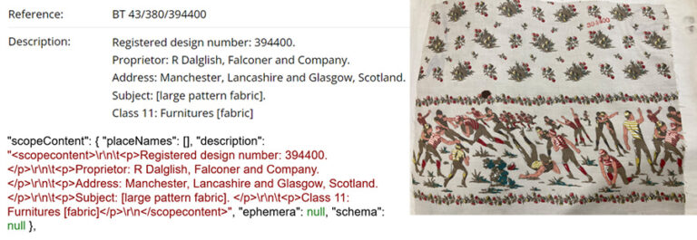
The catalogue data for these two series was extracted programmatically through the Discovery API (see this blog for more information). Although a typical catalogue entry looks structured seen on the page in Discovery, behind the scenes it is held as text embedded in HTML. This can be seen in Figure 1 which shows the HTML format ‘scopeContent’ field extracted via the API below the entry as displayed in Discovery.

To convert a catalogue entry into data to be visualised, it must first be separated into Fields (e.g. Proprietor, Address) and Values (e.g. “R. Dalglish, Falconer and Company”, “Manchester, Lancashire and Glasgow, Scotland”). Then the values may be further processed to extract entities (e.g. “Manchester, Lancashire”). As this was a research project as much as a visualisation one, it was an opportunity to experiment with the ideas of Data-Centric AI (https://datacentricai.org/). Typically, AI-based systems use a mathematical model to perform a task (e.g. identifying addresses). Data scientists create the model by experimenting with a selection of algorithms, adjusting parameters and customising the algorithms themselves, until an optimal model is built. In the data-centric paradigm, a fixed algorithm is used, and effort is instead applied to curating the training data to get the best trained model. This meant using the same neural network design for different tasks (separating Fields and Values, tagging parts of an address, or identifying dates) and selecting sufficiently varied examples to train a model. Pattern matching was used to speed up the acquisition of examples. A typical address pattern might be: “1-2 digits AnyWord Street/Road, CityName”.
We developed three visualisations: designs registered by day, designs by location (city/county/country), and address exploration. The visualisations were designed iteratively, starting with a simple bar chart and then adding data and functionality through a process of feedback and discussion. The D3 Javascript language (https://d3js.org/) was used to build interactive charts. This meant that users could progressively explore the data through clicking on interactive elements which filtered or altered the visualisation.

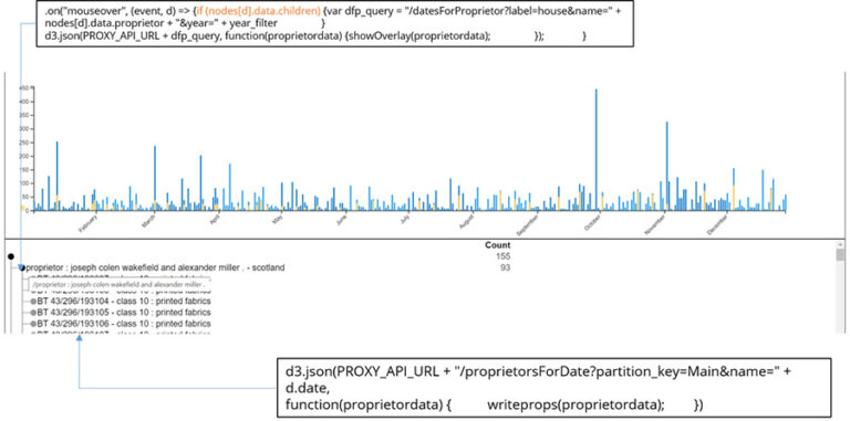
In the date chart (Figure 2) when a blue bar is clicked it triggers an event which displays a list of proprietors submitting designs on that day below the chart. Hovering over the proprietor’s name triggers a second event superimposing their daily activity over the main chart (yellow bars).

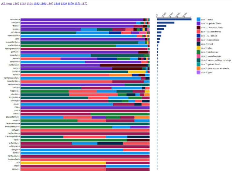
In the location chart (Figure 3), at each location a proportional breakdown of designs by Class are shown, but clicking on a horizontal bar also displays raw counts.

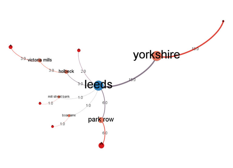
The address visualisation (Figure 3) was different, modelling addresses as a network with clickable nodes expanding to, say, the streets within a town, with counts of designs shown on the links.
Exploring the visualisations from a records perspective
The visualisations enabled the Visual Collections team to draw new insights from the data which would otherwise have been hidden. The collaborative experience was also positive; viewing initial visualisations made it possible for the team to see potential for new research questions and provide feedback, and discuss improvements and adaptations to future visualisations.
The date chart revealed clear variations in the volume and frequency of registrations over time for different proprietors and different classes. Observing specific case studies within the visualisation raised new questions, particularly regarding the factors that may have impacted the frequency at which proprietors used the registration system. Further research could, for example, be conducted into the impact of fashion and commercial cycles, the role of agents in the registration process, and public familiarity with the registration system.
The location chart also made regional trends in the data visible and raised interesting questions about the regional development of industries over time. Data presented in this way may open up opportunities to either challenge or reinforce expectations about regional, national, and international industrial outputs of the era.
Through exploring these visualisations and drawing out research questions from them, we were able to more easily identify opportunities for improving and extending the visualisations to make them even more useful for future research. The key improvements to be made relate to increasing the granularity of the data presented and allowing graphs to be generated showing comparisons between individual companies or regions over time, for example.
Conclusion and next steps
We took an iterative approach to this project, which helped us to develop ideas collaboratively, implementing and reviewing changes in a progressive manner. Being able to explore the visualisations allowed our records specialists to see the records in a brand-new way and encouraged them to see the potential in new research methods. The project wrap-up meeting identified a number of next steps: augmenting the data, enhancing the visualisations to improve the user experience, and further exploration of Data-Centric AI to put the data creation tools into the hands of researchers.