TS – Have you ever wondered what happened to those departments that suddenly disappeared years ago? Or perhaps you are trying to find out which department does what Department ‘X’ used to do?
We have produced the first of a series of visual representations of how government departments change over time to help you access our records and sate your curiosity.
Why is this necessary? Well, The National Archives looks after government departments’ historical records and provides access to them. Departments are created and abolished, and their functions transfer frequently between them. Many of these changes take place at seemingly random points.
Users of our records often need to have an understanding of what changes take place, when, in order to find what they want. We aim to produce accurate representations of this specialist knowledge online.
This information exists in Discovery and colleagues here at The National Archives have unique insights into this specialist area. We hope that visualising this in both a striking and accurate way will open up access to this knowledge still further.
Last year, we gathered data about changes to departments since 1997 to support our Semantic Knowledge Base project. Displaying this graphically is a whole different challenge.
The challenge is to represent something so complex in a way that is as informative as it is accurate, while not being confusing. We toyed with the idea of representing all departments over all time on one single image, much like the striking ‘Tube Map‘ visualisation. It quickly became obvious that the level of detail we require would mean that we ran the risk of ending up with something that resembled a large bowl of spaghetti!
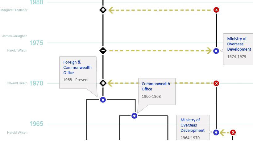
So, we decided to separate the strands of government into themes – the first of them being Foreign Affairs. The style of a circuit diagram should clearly show how responsibilities ‘flow’, from department to department over time. And we’ve given some context to the changes by listing Prime Ministers too.
What we have produced to date is very much a first version, something that we plan to build on and develop (by extending further back in time) and enhance (by providing more links to more information, with the possibility of incorporating departments’ agencies and other bodies as well).
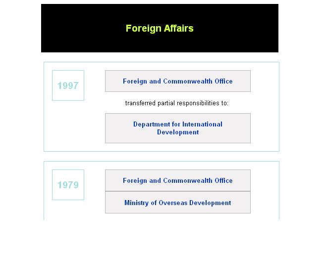
For our more technically-minded users, we have provided the data in XML for interrogation and interoperation with other applications.
The department names can be clicked on to go to Discovery or other relevant web sources for information.
SD – So, how do you visually represent time? Or the passing of governmental responsibilities from one organisation to another? Or one department being subsumed into another?
Evidently the apparatus required to answer such questions includes graph paper, pencils, Sellotape (other adhesive tapes are available), numerous cups of tea, and some intelligent thought and imaginative design ideas (thank you Donny and Claire for the last two). We took some inspiration from various sources – the aforementioned ‘Tube Map’, and the block-style visualisation available on Wikipedia [ref]1. If the visualisation on this page does not immediately appear, click on ‘[show]’ next to History of UK Government Departments with Responsibility for Foreign Affairs. [/ref] – and experimented with what design would suit us best.

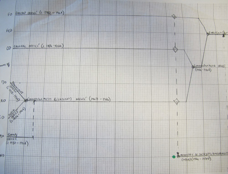
'Foreign Affairs' - Early Sketch
The ‘circuit diagram’ style we chose allows us to simply represent a department’s development (for example, one can follow the line from the historical Foreign Office to today’s Foreign & Commonwealth Office easily, showing a line from 1782 to the present) and the refinement of the number of departments operating in the field of foreign affairs is clearly represented.
We hope that the use of colour and icons adds to the simplicity and encourages the user to understand the movement of responsibilities. Furthermore, by having the visualisation run vertically, rather than horizontally, the user begins their journey in the present, and can work backwards in time, with the added bonus of the ease of scrolling down when viewing on a computer. Also, the use of the ‘zig-zag’ lines allows us to, in a sense, compress the representation of time, in order to show more clearly the occurrences of real organisational change.
We realised early on in the process that simplicity of the design was essential, particularly because of the numerous potential audiences such a visualisation might have. We certainly hope that administrative historians find the representation useful, which is why we have tried to ensure that accuracy is of primary importance, but we are well aware that their knowledge of written sources would be stronger than most. [ref]2. We checked our data against a number of sources. Of particular use were Clifford, Chris, McMillan, Alistair, and McLean, Iain, The Organisation of Central Government Departments: A History, 1964 – 1992 (Nuffield College, 1997), the Imperial Calendar or general register of the United Kingdom of Great Britain (London: HMSO, 1809-1974), and The Civil Service Year Book (1974-2008).[/ref] Otherwise, people with a general interest in government, maybe even people within government, and perhaps those with an interest in designing timelines all might be potential audiences – but we’d love to hear your thoughts.
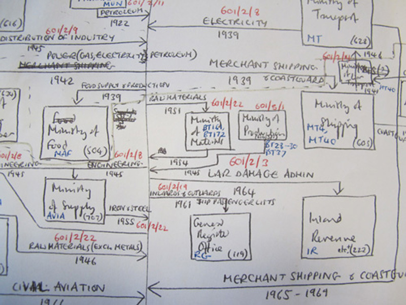
That point about accuracy, though, actually underlines one of the difficulties of this exercise. If the visualisation is based on catalogue data, and yet we want to include each department of state, there is the likelihood of gaps, which would require a large amount of human checking. On a small-scale this is manageable, but when we come to representing the more complex, ‘domestic’ departments then it will be trickier. Speaking of complexities, before leaving The National Archives last month, Dr Ed Hampshire gave me a sketch that he made tracing administrative change relating to trade and industry. Complex probably just about covers it.

Ed Hampshire's 'Trade' visualisation
Nevertheless, we feel that we have constructed a model which can clearly, simply, and accurately represent organisational change in government. We hope to produce a ‘Defence’ visualisation soon, and will move onto the other central departments as well. Also, we will need to show the linkages where departments appear on different themed visualisations. [ref]3. For example, on its birth in 1964, the Ministry of Overseas Development took responsibilities from the Board of Trade, the Department of Education and Science, and the Ministry of Agriculture, Fisheries, and Food as well as the three departments shown on this foreign affairs representation.[/ref]
In the meantime, we would be most grateful to hear what you think, and any suggestions for improvement you might have so that we can include them next time around.


This is fantastic. Did you create your own XML schema or are you using an existing one?
Hi Jim,
Thanks very much! This XML representation isn’t based on any known schema; it was simply put together in house (along with an accompanying XSL style sheet) to provide an alternative means of access to the data, which otherwise would only be presented via an image map. Please do let us know if you have any other questions.
Great initiative and being able to easily visualise changes in administrative structure is really helpful for a range of purposes.
Just to throw a little cold water…. Peter Scott and his colleagues at National Archives of Australia have been doing these diagrams since the 1960s, and also to track the movement of series through agencies (of course this is a by product of the wonderfully flexible ‘series’ system). Check it out in the new Peter Scott book. There are great examples, albeit in paper form, published in Archives and Manuscripts from the late 1970s, too.
Hi, I’m very interested in those Australian products. Can you please provide links?
Hi Barbara,
I worked on the visualiasation project team with Tom and Simon.
Thanks for your comment. It’s interesting to hear that archivists elsewhere are undertaking similar work. We will certainly investigate Peter’s work.
Claire,
Adrian Cunningham’s paper at the recent ICA 2012 conference in Brisbane may be of interest, “Peter J.Scott and the Australian ‘series’ system: its origins, features, rationale, impact and continuing relevance” http://www.ica2012.com/files/data/Full%20papers%20upload/ica12Final00414.pdf
Hi David,
Thank you for letting us know about Adrian’s recent article. We’ll definitely have a look.
Thank-you for showing your thought processes and “working” so to speak as well as the visualisation itself – I’m cataloguing into a functional structure at the local government level and you’ve given me insight into one way of providing a departments-over-time access route for users. I’ll also follow other commenters suggestions to explore the Australian strand, thanks.
Hi Justine,
Thanks for getting in touch – glad that we could be of some help. Do let us know how you get on.