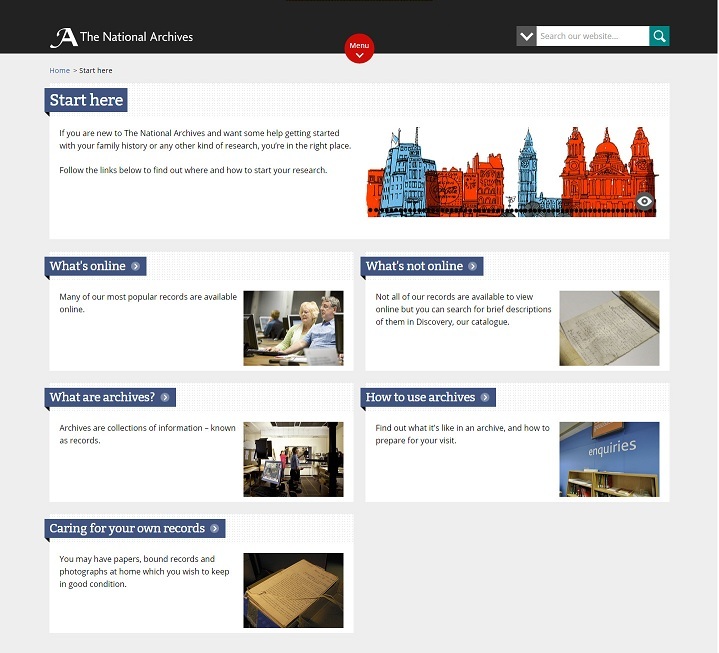
Over the last year we have been redesigning the ‘Records’ section of the website, now called ‘Help with your research’, aimed at researchers needing help and guidance. Following on from improving access to our research guides we have now redesigned the remainder of this section.
What’s changed?
The vast majority of the changes have been cosmetic; that is to say just moving the content into a cleaner, responsive and more visually appealing design that can be used on any device, whatever the screen size.
However, we have a few small adjustments to the structure of the pages:
Flattening the structure
Previously under our old ‘Records’ heading (now Help with your research), we had a section called ‘Understand the archives’. We’ve now bought all the content from that section up directly onto the ‘Help with your research’ landing page. The more descriptive title of ‘Help with your research’ better caters for this content and removing the additional layer of navigation will give users more direct access, making it easier to browse.
This content that has moved includes:
- Start here section
- Reading old documents
- Citing old documents
- Webinars – linking directly to available recordings, and what’s coming next
We’ve removed the ‘Caring for your own records’ page (still accessible in our web archive) and we will be writing a blog post to give updated guidance to researchers on how best to care for their records – watch this space!
Online collections in one place
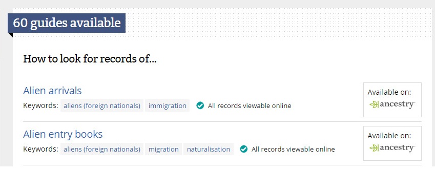
The biggest change has been to our ‘Catalogues and online records’ page. Our user research highlighted that the content and layout of this page was confusing, and seemed to include miscellaneous content. It contained a small collection of our online records (ones that have been digitised and made available through partner websites such as Ancestry and Findmypast), as well as links to other catalogues and some of our online exhibitions.
We have now added the collections held on partner sites to our main list of online collections so they are all now in one place regardless of who is offering access to them. Feedback from our users highlighted that they felt they shouldn’t have to look for online collections in different places. We’ve made it easy to identify those available on Ancestry and Findmypast through the use of their logos and clear calls to action.

Online collections available on partner websites
We’ve put the remaining catalogues and databases, as well as the online exhibitions, directly onto the ‘Help with your research’ landing page. We have ensured our current ‘Catalogues and online records’ page is still accessible for the next month to give you time to get used to these changes.
We hope that the changes will make the content easier to read and to navigate, as well as being nicer to look at, regardless of what device you are using to access our website!
What’s next
Over the next few months we will be tackling our About us pages, starting with the fundamentals – Our role. Keep an eye out for our new-look pages.


I wish that you would stop messing-around with your website. The old A2A site was excellent, quick and easy to use, all it needed was the addition of more catalogue entries from county archives.
I have yet to look at your latest version but doubt that it will be less frustrating than the last update.
Hi Margery,
Thanks for your comment and I’m sorry that you are unhappy with us making changes to the website. This is always a tricky one – I really do appreciate that it can be frustrating when websites you are used to change. However, feedback from our users mixed with the nature and the speed at which the digital world moves means that these changes have been necessary.
Given the fact that now over 1/3 of our users use mobile devices to access our website means that we need to ensure we offer a good experience no matter device you are using. Before the redesign, it was clear that that the experience was poor when using mobile devices and we have tried to remedy that. Our user research also highlighted a number of other issues that users faced when using our website for their research;
When making any changes, we keep very firmly to the principles of user centred design to make sure that the needs of our users are at the heart of the design process. You can read about why we made these changes and how we involve our users in this blog post: http://blog.nationalarchives.gov.uk/blog/help-research-website-redesign/
It’s also fascinating to see the way the website has changed over the years; On Pinterest, we’ve put up images of our website through the ages (well since we first had one in 1997!) https://uk.pinterest.com/uknatarchives/the-national-archives-online-the-story-so-far/
You can also use the web archive to look at how our website has changed over the years: http://webarchive.nationalarchives.gov.uk/*/http://www.nationalarchives.gov.uk/
Thanks,
Paul
It is a wonderful idea to make some of your records search and downloadable on FindMyPast and/or Ancestry and I was really excited when it happened because it is much more convenient and accessible for people who either do not live near TNA or do not have the time to visit.
It is particularly good to have the Musters from 1812 – 1817 on Ancestry and I do hope this is going to be extended very soon. You can search for a name and then browse through the Muster to find information given at the end of a three monthly muster.
However, it is difficult to find some British Army and Militia records that are on TNA but cannot be found on FindMyPast.
I have found records on TNA which give the regiment or place of birth but when clicking through to FindMyPast (for which I have a subscription), it is necessary to search again. Then, having got a list up of a certain name, it is necessary to go through every single item and, even then, either the record is not there or the information is not given.
Many of these records on FMP do not even have Christian names or even initials. Having looked at a number of British Army records, I can believe that the writing is difficult to decipher but I do not believe that the Christian name is not there. Names are often given in short form, such as Jno for Jonathan or Tmy for Timothy but it is quite easy to get used to this.
I have written comments and emails to FMP but to no effect. Perhaps next time TNA arranges for them to have a record collection, it would be advisable to emphasise the need to be more precise about this sort of detail.
correction: Left behind IN THE swarm. Sorry.
Hello Paul.
You say: “Given the fact that now over 1/3 of our users use mobile devices to access our website means that we need to ensure we offer a good experience no matter device you are using. Before the redesign, it was clear that that the experience was poor when using mobile devices and we have tried to remedy that. ”
My thoughts: This has been common practice for website designers across the board but as a researcher who prefers a full page view (verses a condensed version, or constant scrolling), I feel jilted. Or left behind swarm. *I* simply can not run around on the fly with a handheld device glued to my side, searching for *free* wi-fi access, and reading bits and pieces of a net page at whim, i.e. follow the protocol of hand held device users.
To maintain focus I sit at a desk, pay for my own internet access, maintain a printer, and (here’s the kicker) wait (and wait) for all those mobile device codes to download in the background of my screen.
Our connection speeds in the rural areas of the upper midwest USA are slow and unreliable, (We have no clue what 4G is…we’re still waiting for 2G.) so I am all for simplification but I have to wonder if, in a few years, all the attention being given to handheld device apps will falter and backfire- especially when factored into the actual sales produced by such device services.
Just a thought, Paul. What a job you have, and thanks so much for doing it.
Kim