It’s been almost three years since we introduced the current homepage as part of our website redesign: it was the first part to go live. Even though it has been well-received by our users and the industry, the web has evolved significantly in the last few years – and, with it, peoples’ expectations.
The web team has also come a long way, embracing an Agile approach and significantly improving our working processes to support this. It definitely feels like time for a refresh and what better way to kick start the process than a design hack day (or two).
Collaboration is central to the Agile approach so it seemed natural to include people from across the organisation to discuss a refresh of our homepage. We started the process earlier this month, with the web team inviting our colleagues to participate in our homepage hack day/s.
So what is a hack day?
The term, like much of Agile, has its roots in software development. A hack day is a way for programmers, designers and managers to rapidly brainstorm and prototype ideas for new projects.
For the web team, the hack day seemed the ideal opportunity to bring people together and to generate a range of concepts to improve our home page. It’s a significant challenge, as the home page needs to represent a diverse range of user groups, our business priorities and our direction as an organisation.
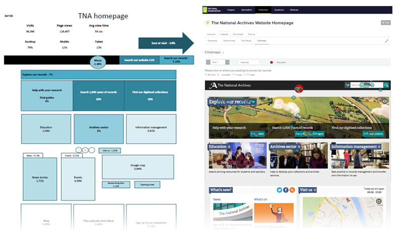
On the first day the group split into three teams, bringing together people with a range of specialisms, interests and perspectives. Helen Oake, our metrics analyst, started the day by taking us through some recent usage heat maps of our homepage. Beth Morrison, a user researcher, presented the results of an online survey conducted the previous week.

Homepage heat map and survey results
We continued by framing the objectives for the days and outlining an agenda of tasks. The teams were given a basic set of prerequisites:
- you must work on paper, at least for the first part of the hack day
- you must take your designs to visitors in our reading rooms and the surrounding Kew area to gather feedback
- you must present your ideas/concepts at the end of the second day
How the teams presented their ideas for the homepage improvements was entirely down to the individual team members.

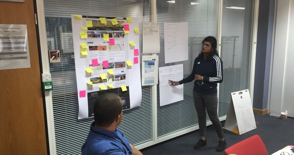
A team member talks through their ideas
This flexible approach allowed for a range of ideas and enabled our teams to play around with different concepts.
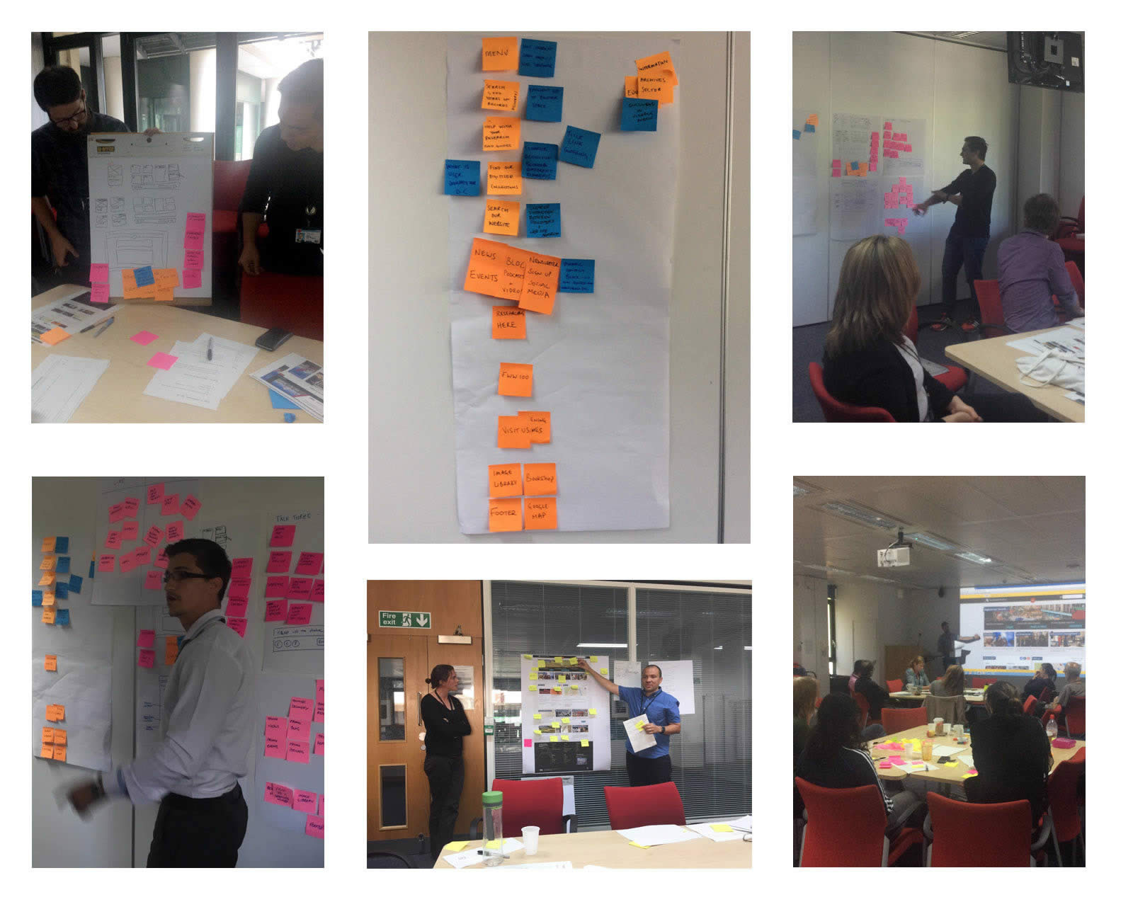
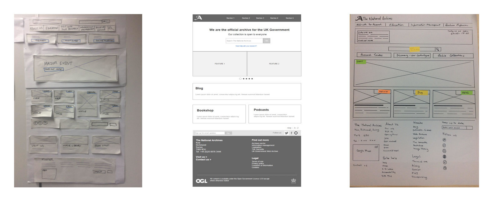
The hack days were definitely full of energy (that may have been down to the snack table!). Each team had a healthy sense of competition and approached the tasks in different ways. Some scribbled on paper, some created black and white wireframes and others created high fidelity visuals. The motto for the days was ‘whatever goes’ – we tried not to be too prescriptive, to allow for creative input and make it as inclusive as possible.

Members of different teams present their ideas
Various colleagues from across the organisation joined us for all or part of each hack day. We even had some guest attendees from Parliament, Emma Allen, Director of Digital Development, and Kheira, a member of her UX team.
Findings
It was interesting to see the similarities between the initial concepts.
Each group identified a need for a more welcoming and flexible promotional area, making better use of our footer, improving the visibility of our menu, reducing clutter and leading users quickly to the most widely used sections of our website.
Speaking to people in our reading rooms was insightful and highlighted some labelling and user journey issues we need to address. Involving different departments reinforced the need to balance priorities and opinions.
The hack day offered us insight into the challenges of creating a homepage that meets the needs of our different user groups and the goals laid out in our Archives Inspire plan.
Next steps
Before making any changes, we still have a bit more work to do. Further statistical analysis is already underway and we will be getting input from more colleagues across The National Archives. We will then work towards creating prototypes, which we will share on this blog to get your feedback.
