It’s an exciting time for the web archiving team. We recently completed our first large piece of user experience research which has given us lots of interesting insights into who our users are and how they use the web archive. Thank you to everyone who took part.
The next step is to use the insights gained from the study to improve user experience. That’s where we need your help.
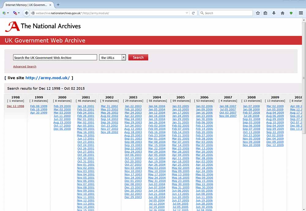
We’ve been aware for some time that our access pages and banner would benefit from some improvements. The basic structure of our index pages was designed in the early days of web archiving and, unfortunately, doesn’t cope well when the website has been archived for more than ten years. The current index page for the British Army website is a good example:

Current UK Government Web Archive index page for British Army website
It’s annoying to have to scroll across to see recent dates. Additionally, as the design at the top does not expand to the width of the rest of the page it looks quite untidy and, let’s be honest, it’s generally quite dated.
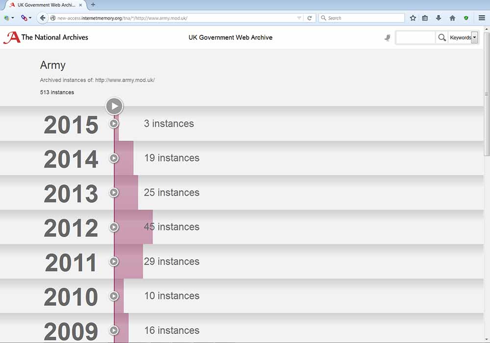
To improve this, our contractors at the Internet Memory Foundation (IMF) have produced a completely new design:

Proposed UK Government Web Archive index page for British Army website
As it is based on a horizontal structure the new design copes more successfully with displaying capture dates for a larger number of years. It also looks more modern and displays better on a phone or tablet.
We have also been aware for some time that the way our red banner works is not ideal. This banner displays on all the archived websites in our collection to inform people that they are viewing an archived site. This is very important, as we don’t want people to confuse an archived website containing historic information with a live website containing up to date information.
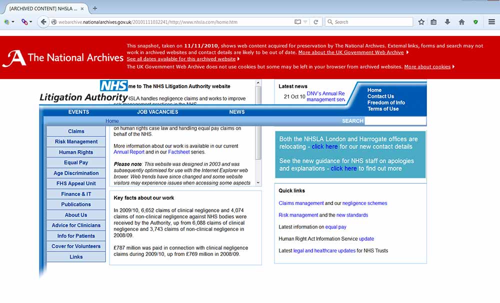
Unfortunately, the way the current banner works sometimes interferes with the way the archived pages display. In the example below our banner does not display at the top of the page, which causes the horizontal menu to be pushed down so it obscures some other content:

Example of display problem caused by current UK Government Web Archive banner
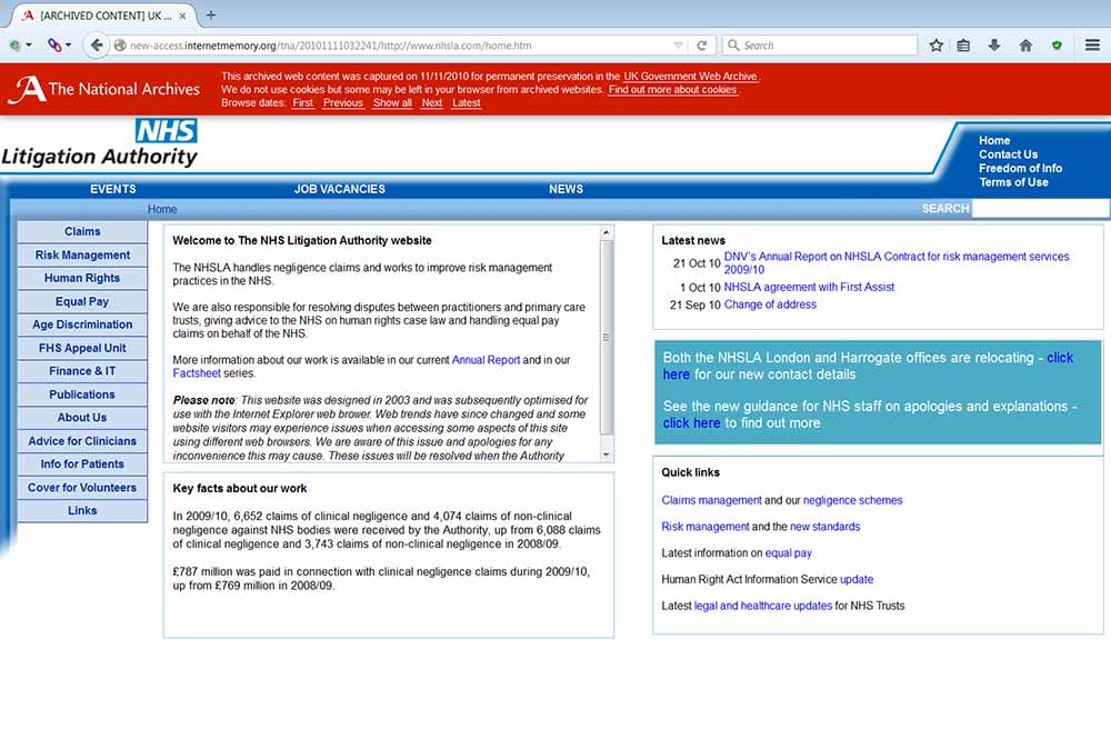
IMF have created a new banner, which is similar in design to the current version but is applied to the archived pages in a different way. It should solve most of the display problems of the current version, and certainly fixes the display problem of the archived version of the NHS Litigation Authority site:

Display problem solved by proposed new UK Government Web Archive banner
We’ve also revised the text displayed in the banner and added the ability to navigate to the next and previous archived versions of the site.
Help us improve
It would be really helpful if you could look at the new designs and let us know what you think. The new index page design is available here: http://new-access.internetmemory.org/tna/*/http://www.army.mod.uk/. You can view archived pages with the new banner by clicking on some of the dates on the index page.
Alternatively, you can view the index page of a particular government website:
- find the url (web address) of the site you want to see
- add the url to the test prefix. For example, to view archived versions of the Food Standards Agency website place its url (http://www.food.gov.uk/) after the test prefix (http://new-access.internetmemory.org/tna/*/) to make a long url http://new-access.internetmemory.org/tna/*/http://www.food.gov.uk/
- copy the long url into your browser address bar
When viewing the new pages please bear in mind that the test environment might be slower than the live web archive.
Please leave any feedback in the comments below or send it directly to our team mailbox: webarchive@nationalarchives.gov.uk
We’re looking forward to hearing what you think.