The UK Government Web Archive’s improved search is now live! After one year of user testing, analysing, coding, and more testing, we are excited to see the new search live with many of the features that our users asked for.
Our journey began in summer 2017, when our digital services colleagues carried out a user study on the then newly-launched search. We had already learned quite a lot from the conclusions of a previous user study, and some of those findings had already been implemented – but our latest search was a new product that needed further user testing and refinement.
The user study that we carried out consisted of surveys and think-aloud testing over the phone. The participants were carefully chosen to ensure that the sample was, to a great extent, representative of the different types of users of the UK Government Web Archive. After months of user testing and analysis of the results, the conclusions and recommendations were revealed. The findings that were related to search were:
1. Search within archived ‘host’
These were popular and were used. However, for example, there was a lack of understanding of the term ‘host’ in the exclude/include filter.
Recommendations
- Update a term like ‘host’ to something more plain English
- Introduce restriction at search time as well as for filtering
- Introduce easier search by URL
2. Search results
The number of search results can be overwhelming. This highlights the importance of getting the filters right so that people are able to manage their results.
Recommendation
- Look at ways to help people restrict, refine, and un-refine their search – either through the way the search works, or by providing options in filters to help them narrow their search
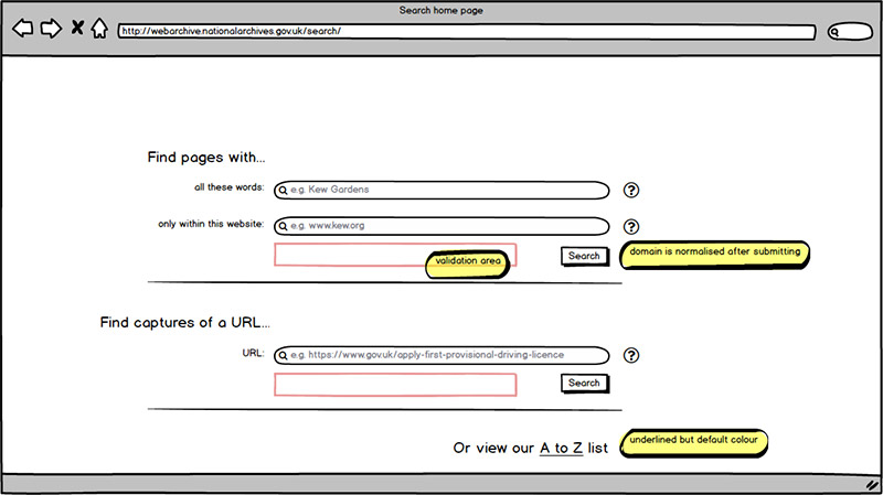
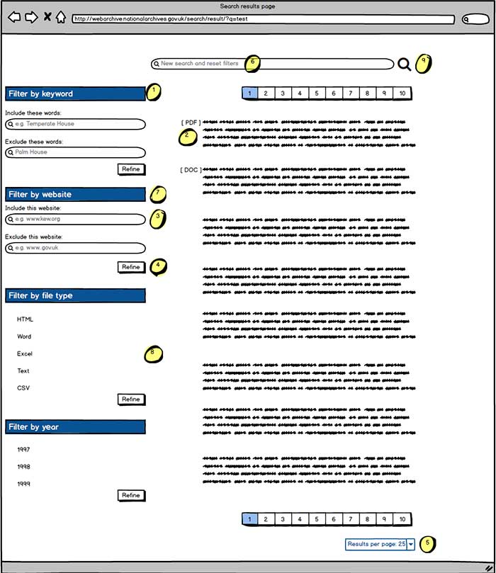
We wanted the next iteration of the search to incorporate these recommendations. But one must be aware that, when a group of colleagues go through web design recommendations, they might have different understandings of the problems or the solutions. To make sure that there are no misunderstandings, it is useful to draw wireframes – and to tweak these wireframes when discussing the recommendations and the solutions. With wireframes you can be almost certain that everyone in the team is on the same page.

Wireframe search interface

Wireframe search results
Once we had agreement on how to implement the recommendations, we sent the wireframes to our suppliers at MirrorWeb to discuss the suggested design. Then, MirrorWeb’s developers created the new interface and uploaded it to a test environment to ensure that we were happy with the design and any potential bugs were eliminated. Finally, we pushed the new search to the live server and it became accessible to the public.

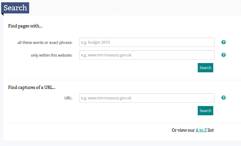
The new search interface

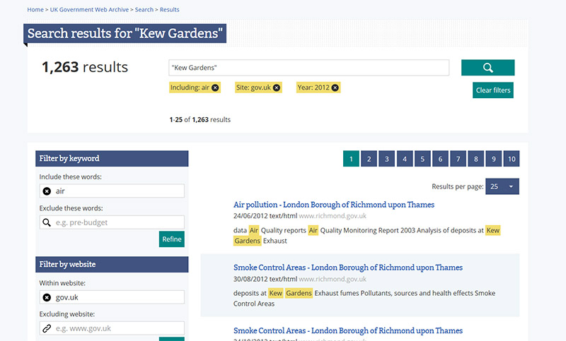
Search results for ‘Kew Gardens’
But (of course) the journey doesn’t end here. We are looking at better ways to improve the service. If you have any feedback on the search service, we’d be very interested to hear from you.
Nice work, especially on the home page of TNA. I took part in a recent user survey on the website structure and usability, and it’s great to see that you have made it easier for researchers to find what the archives hold, without losing the sections that will appeal more to those looking for more general topics. I think a lot more people will access your valuable research guides now that all they have to do is click the “Help with your research” button to find them. Thanks for listening to user concerns and taking them into consideration.