Many of you reading will have seen our Olympic Record, previously blogged by Melinda and Sarah. I’m one of the in-house Web designers who helped to develop this resource and since its launch we’ve all been delighted by its popularity, including recent coverage on BBC’s Click (the slanted camera angles and zooms really amplified the site’s dynamic transitions and effects, bringing it to life).

How did we get here? A look at the design process behind The Olympic Record
To assist in the process of helping people get quicker, closer access to the records here has been very satisfying and I’ve wanted to shed some light on the design and development process behind The Olympic Record since its unveiling.
Around a year ago the Web team began discussing the project with the Collections Knowledge team, led by Cathy Williams and Fleur Soper. Together we recognised the potential for a new online resource to provide access to documents within the Archives concerning people, places and incidents that could be connected to any of the 30 previous modern Games. It would provide a historical resource, whilst engaging creators of new records and archivists – to actively collect 2012 records for the future.
We had to conceptualise something that could contain a vast range of images with supporting descriptions and deliver them in a rich, dynamic way to engage our readership. From the start the idea of a ‘timeline’ in which users could embark on a journey from 1896 to the present proved popular. I then got to work adapting a Javascript-based ‘sliding’ content viewer to accommodate at least 30 different ‘pages’ of content – one for each Olympiad. This would allow us to present the content with ‘tab-like’ navigation without users leaving the main page but also provide a more satisfying sense of moving forward (or back) in time from year to year on screen. And after all that it still had to work on both iPads and Internet Explorer 6 alike, such remains our reach.
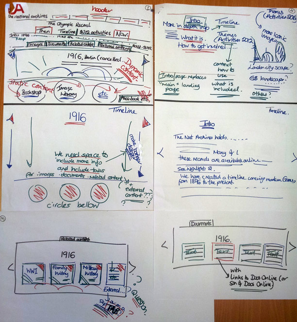
This was a great challenge for us all as we found that the amount of content associated with each of the 30 Olympiads varied in quantity and consistency. Extraordinary photographs from the turn of the 20th century were to rub shoulders with letters from 100 years later. We considered how this content might best be ‘advertised’ via a vivid but coherent interface, and with the flexible timeline structure in place we could then think more about how colours, iconography and background detail could enhance the experience. We went from pens and paper to Adobe CS and back again mapping out the site’s structure and required elements.

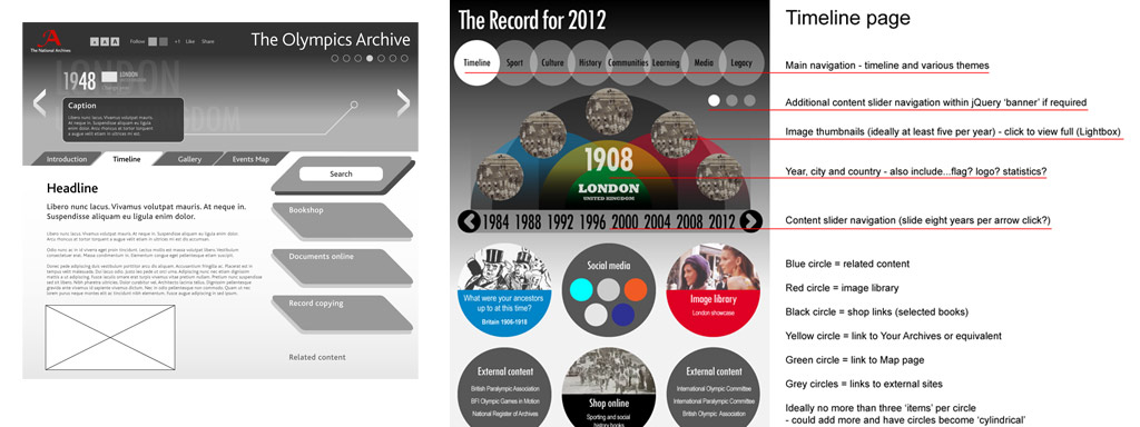
The earliest wireframes created in Adobe Illustrator focused primarily on layout before the exact nature and range of content could be determined.
I favoured the use of circles from early on as I hoped they could be recognisable as Games-related without bearing too great a similarity to the famous five interlocked rings. Earlier designs featured five overlapping circles and five corresponding colours, to hint at the Olympic rings. We soon realised these kind of similar depictions are not quite in line with the London Organising Committee of the Olympic and Paralympic Games’ (LOCOG’s) guidelines on branding and use of the Olympic rings. Following LOCOG’s advice, we found that we needed to develop our designs away from that idea.
After additional feedback and guidance from the British Olympic Association (BOA) our design evolved into something more suitable and independent. I’d been scratching my head looking for a simple way of expressing a link to the subject matter visually, without breaching the aforementioned guidelines. A flash of inspiration occurred during one of our many sanity checks. Fundamentally we were dealing with the motion of time and widespread activity, and so these simplistic but precise depictions of a clockface and torch flames came to me. Our ‘fiery’ Archives red heralds the portal to external websites detailing activities surrounding this year’s Games. The timeline’s blue tone complements and contrasts suitably with this, but it was important to not overload the pages with different colours, with so many thumbnails of scanned imagery and screenshots of websites to display.

As more colour was introduced into the layout, the dilemma of how to best represent the Olympic connection visually intensified.
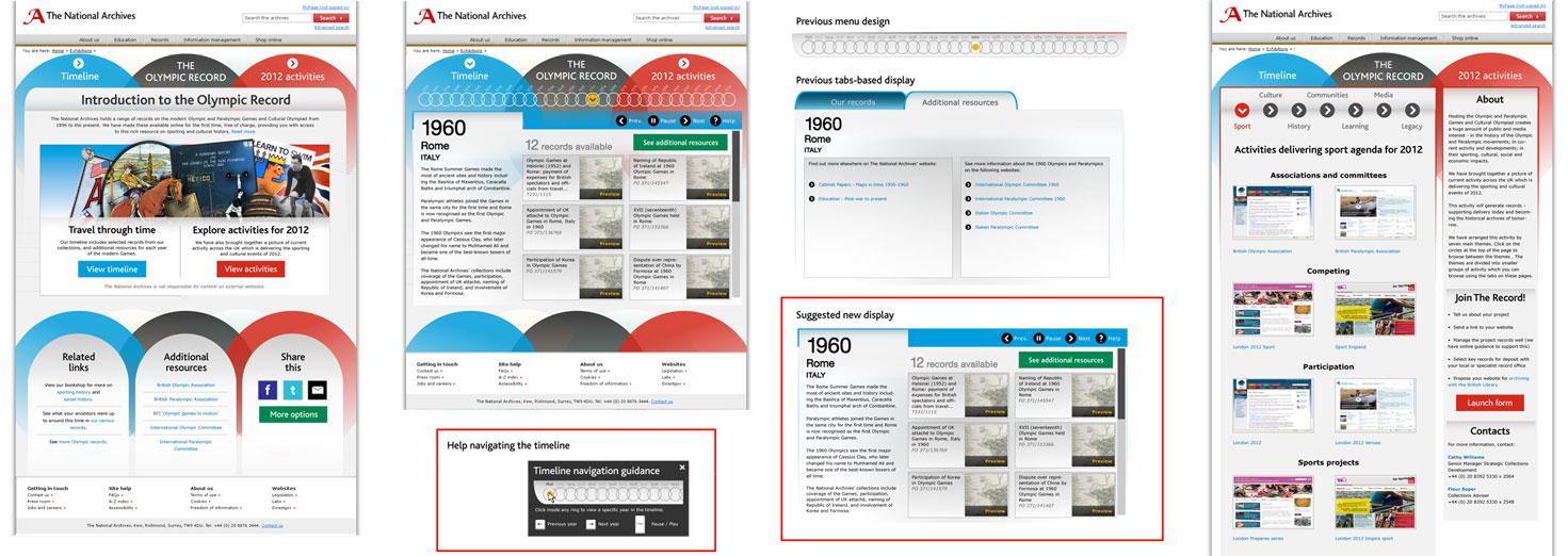
A persistent effect introduced early on were the curved lines in the timeline’s background illustrating its smooth linear flow. A last touch was the refined collage of imagery from the collection that adorns the site’s landing page. We tried to ensure this was as diverse as can be in terms of the people, places and periods of time it depicts, whether photographed or illustrated. We made the switch from an originally darker page to something more in line with the rest of our site, for consistency and optimised clarity. After several variations of layout were produced, we could scrutinise them closely to determine the best approach.
As much as The Olympic Record itself allows users to ‘travel through time’ and explore documents throughout the decades, the design that we settled on was the end of one of the longest journeys I’ve taken on a project, with each layout ‘mock-up’ shown here another stop along the way. I learned so much from working on it and I hope all visitors to this particular destination have been similarly informed and inspired.

Original version of the header image featuring a clockface and 'flames of activity'.


