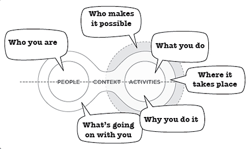
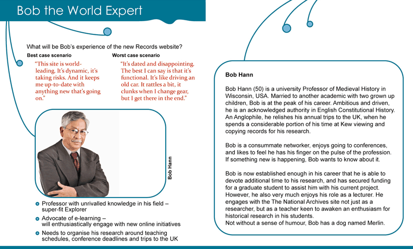
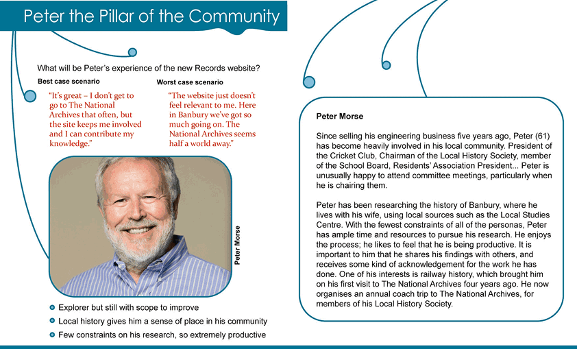
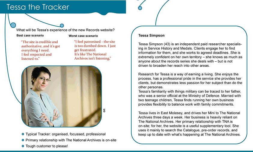
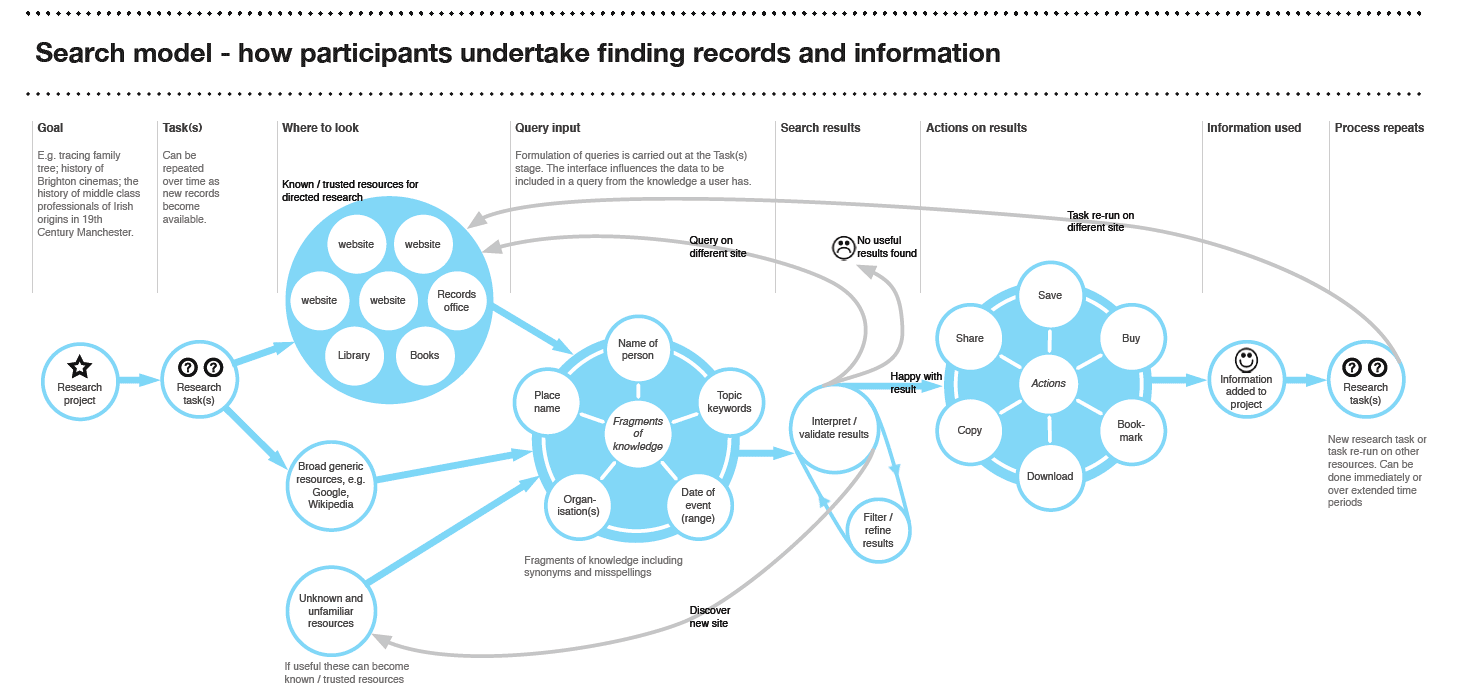
Image from Stephen P. Anderson's Poster from IA Summit 2009
As many of you may know, The National Archives has launched a beta product called Discovery. Discovery is not only a replacement for our current catalogue, but it will eventually provide a platform to enable searching across the many different databases and datasets held at the archives.
The aim of Discovery is to create an effective and enjoyable user interface through an understanding of who our customers are: their tasks, expectations, capabilities, limitations, preferences and context of use. The best interfaces are known to not only support goals and tasks but also recommend interactions that extends users’ activity in ways that makes their journey more effective and satisfying.
To achieve this, our design and development process has involved users from outset and where feasible, as active participants. We have used multiple methods over the last few years, such as interviews, diary studies, surveys, workshops, focus groups, web log analysis and user testing to acquire understanding and empathy towards the needs of our customers.
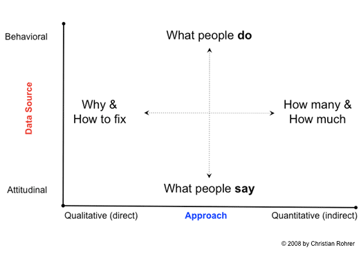
Graph showing research strategies: Christian Rohrer 2008
Our findings clearly painted a picture of The National Archives’ customers with widely differing levels of expertise, motivations and some significant constraints on their behaviour. To create a single interface that can satisfy the seasoned archivist who knows how to navigate expertly through archival holdings and the retired grandmother who has no archival or subject knowledge is quite a challenge. If you then add the Google search paradigm to the mix with a sprinkle of a popular genealogy TV series, the perception and understanding of search become quite messy.
We have found that the needs and expectations of our users are sometimes in conflict as the ‘one size’ fits all approach is simply not appropriate for our users. You may hear statements that the ‘average user’ would do this and the ‘average user’ would want that. My questions are: Who are these uniquely average human beings that will provide satisfaction to the masses? What is the criterion that is required to be part of this fantastically average group that we are all desperately trying to make our products for? I’ll let you into a little secret… you will never find these people. The simple truth is, we are all unique individuals with our own set of likes, dislikes, experiences, disabilities, knowledge and so on.
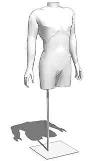 Consider this story. A study in the USA (Bailey, 1982) looked at 4,063 adult US men who were chosen at random. The men were measured (height, chest, arm length etc.) to see how well they conformed to the physical body dimension averages for their population. The first measurement was height and only 1,055 (25.9%) of the men were found to be close to the average height. The rest were asked to go home and the experiment continued with the remaining 1,055. The second measurement was for chest circumference and only 302 (7.4%) of the men were of both average height and average chest size. The rest were asked to go home and the experiment continued with the remaining 302 men. The experiment continued in this way, working through 10 physical body dimensions in total. When the study came to the tenth measurement only 2 of the original 4,063 men were left. After the tenth measurement all participants were eliminated.
The point that I’m trying to make is that the ‘average’ person is actually a rather unique person. The data ninjas out there will tell you that aggregated data can never provide real insights to inform strategy and design. Data needs to be broken down to enable analysis. Without segmentation you will only succeed in masking your failings and lose the opportunity to gain competitive advantage in your industry.
It does not make sense to design for one person – especially if this person doesn’t exist in reality. But conversely, it’s just not possible to design for everyone. So where does that leave us? Well, what you can do is design for a smaller group of user types whose characteristics, motivations and tasks broadly represent a wider audience. This is called persona-based design and is the approach that The National Archives uses to develop features, functionality and content across our research services.
Using personas in the design of systems and products is currently one of the most popular ways to identify, understand and document the needs of your users. Alan Cooper is credited with having created the first persona for software development purposes back in the early 1980s.
Persona-based design uses fictional characters based on actual observed behaviours of real users. Each customer profile is a composite of qualitative research, created from similar behaviours, tasks and motivations of users. Current and potential users are interviewed and observed to identify not only their usage of a system but also their daily routines to give an in-depth understanding of their lifestyle and the challenges they face. Skilful analysis is then required to uncover patterns across user behaviour to create groups of customer type and the characters that reside in within these groups.
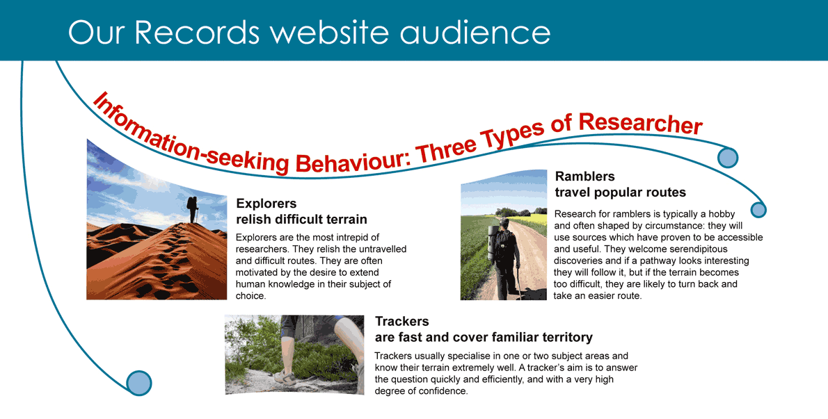
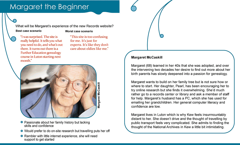
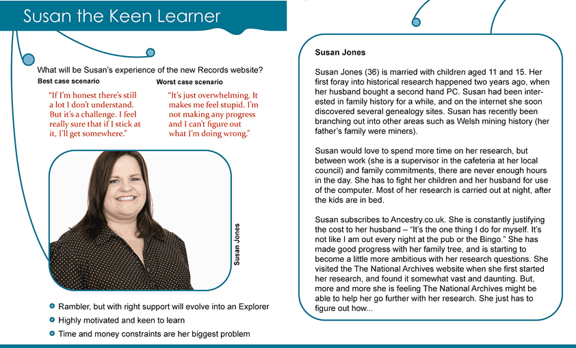
Our findings identified three types of information seeking behaviour which we labelled Rambler (Beginner), Explorer (Intermediate) and Tracker (Advanced). We used the hiking analogy as it is provided a clear real world comparison that people could quite easily understand and communicate through. Within these behaviour types we created a detailed set of personas that described the information gathered as representative people who use our research services.
Our personas have helped determine which type of online services we need to prioritise. Would a proposed feature significantly improve the user experience of one or more personas? Would it compromise the user experience of another? Would it answer a need which is currently not provided? This approach has enabled us to target our resources to focus on the different needs, goals and skill levels of our diverse user base. Our design effort is used to support goals rather than be driven by an individual’s ideas.
So how have we used customer research to develop Discovery? Well, we have defined a clear strategic direction for search based on an in-depth understanding of online behaviour and how The National Archives fits into a wider information environment. We know researchers use multiple search services simultaneously and formulate their queries prior to visiting our website.
We know that search queries are predominately constructed in human terms using the fragments of information a user knows, not on an understanding of the metadata we provide. We know that the mental model for search is based on successful experiences across multiple resources and conventions learnt from other websites – most notably Google.
We know that researchers do not want to miss any single piece of their puzzle, submitting broad search queries that will return a wide result set and then manually (and painstakingly) sorting through these. This anxiety around missing out on a vital record leads to researchers postponing filtering and narrowing on search terms until they are confident that a crucial piece of information will not be missed.
We also know that the interface will dictate the way a user will search. The Discovery search interface is now much more closely aligned with the format of users’ search queries than of the current Catalogue. The search interface for the catalogue presents three fields to the user, and although two displayed as optional, many users felt it was necessary to fill in all the fields. This would often lead to null search results or too large a result set to be presented by the catalogue. Discovery, on the other hand, simplifies the input process, by presenting a large dominant search box that needs no explanation. Users are prompted to enter a general search query or a catalogue reference with no limits on the amount of results that can be returned. The more advanced user has the ability to create more complex queries using the ‘more options’ tab or the ‘advanced search’ link.
The presentation of the results set also takes a different approach in Discovery when compared to the current catalogue. Results in the catalogue are initially grouped by the respective government department, and ordered by the number of results in each of the departments. This approach assumes an understanding of the underlying data structure and also that, because a department has fewer results, the records contained will be less relevant. In Discovery the results are simply returned based on relevance, regardless of how the data is structured. The results are also easier to scan and interpret in Discovery, providing the option to view a simpler version of the results set, enabling quicker scanning for our more advanced users and also the ability to increase the number of results per page.
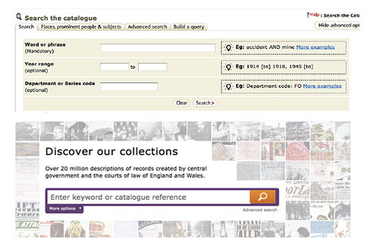
Discovery vs the Catalogue
The biggest improvement we have made by far is the inclusion of the contextual filtering options on the results page. These options allow users to refine results based on date, subject, department and catalogue level. Deferring these filtering options to the point where results are seen aligns faithfully with the users’ broad search query model and subsequently reduces the burden to understand the archive’s structure.
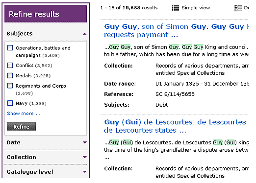
Filters in Discovery
We also have added other features such as the ability to download the results set as a CSV to enable your own data interrogation offline and experimental features such as user tagging to explore other ways to enhance the metadata of the records. We have also tried to improve the clarity in regards where you are in the catalogue structure by providing a visual distinction to whether you can order the record or you need to go further down the structure. On this point I would like to say that we are currently working extremely hard to fix the browse feature as we know it is an integral part of your research process and we hope to release a browse version very soon.
It is understandable that all of this represents quite a change for many of our users, especially those who have formed a close relationship with the catalogue over the last decade. The seasoned veterans will remember the paper catalogue, and understand that the current catalogue works very much, if not exactly, how the preceding paper catalogue worked. This was necessary at the time to provide familiarity and productivity to archivists, historians and academics moving to a digital age. The digital revolution is now everyday life, one which dictates not only our expectations on search and retrieval but also the different ways we consume and contribute data.
We want to open up the public records to the public and not just the advanced users who understand how to interrogate an archive. It is clear that you will always be more productive searching our records if you have a certain level of archival and subject knowledge, but we are actively trying to minimise the steep learning curve that is present in the current catalogue.
I know that there have been issues and bugs in Discovery, and there has been feedback questioning whether the system was created with users in mind but, hopefully, from this post you can see it has. Discovery is still in beta and its development is an iterative process between The National Archives and our customers. Please come along with us on this exciting journey, continue to be vocal about your needs, and together we can build a great product that provides an enjoyable and productive experience for all.
Discovery may work for others but it is in my personal view it is not of any help to researchers and is a hinderence and has not been designed for researchers, although having the databases on one system is good. With the old catalogue you could go into a series of departmental records and go through the latest releases (i.e. what latest series have a department transferred) but you can’t do this with Discovery as departments have been split into some sort of series within a department. The subjects indexes are odd, for example married quarters are indexed under ‘Marriage and Divorce’ rather than ‘accommodation’, surely ‘marriage and divorce’ is what it says and not for something else like buildings .
Is not the old catalogue to be turned off soon so it is not a matter of a process between TNA and customers as stated and new accessions are not being put on the catalogue but added to Discovery, see Readers’ Forum July 2012.. Has all of the information been transferred from the catalogue?, as the actual date documents were opened is no longer available and this can be a key issue and it is almost impossible to find out what documents have been released, there was a time when TNA used to have a list. It is not correct to say that Discovery returns searches by relevance, how can Post Office records be listed before Treasury when you look for Treasury.