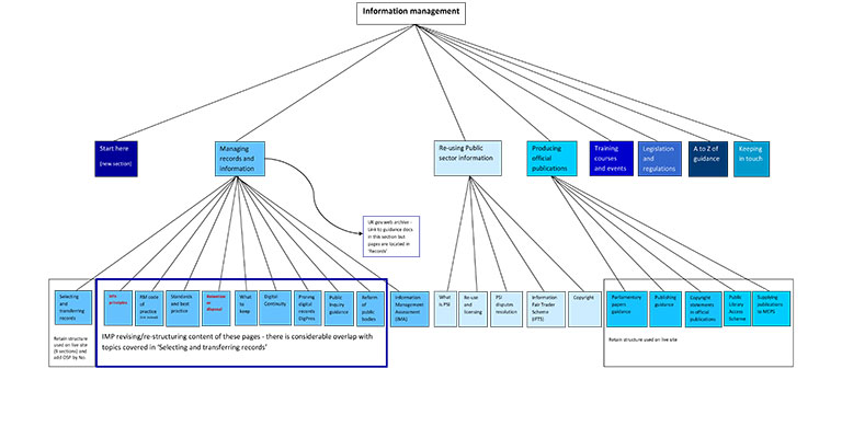
The National Archives advises on the use (and re-use) of public sector information, and provides advice and guidance to government departments on how to manage their information and how to produce official publications. The Information Management (IM) section of our website is a key tool in helping us to do this. The website team have worked closely with colleagues to improve the web structure and make it easier for users to find the guidance and information they need, as part of the wider website redesign.
Users were telling us that they couldn’t find their way around the IM area of the site. This was due in part to a combination of where we had located sections, the routes to navigate to them and what we had called the pages and the guidance documents. So for example, guidance aimed at IM professionals was spread among different sections; the Information Fair Trader Scheme (IFTS) was linked from the landing page but not easy to find otherwise; and some users were unclear why there was an ‘official publications’ section within the IM site.
To form ideas of what our audience want and need we started out with initial meetings and discussion sessions within The National Archives. We routinely compile statistics from real users – page visits and guidance document downloads – and the statistics and comments from colleagues fed into the personas (basically, user archetypes) we were developing. Personas help to keep the focus on user need and user behaviour.
We also explored the search terms people were entering over different time periods. This revealed a few surprises; for example, copyright and Crown copyright were consistently the top terms searched, but the existing structure didn’t reflect their significance to users. It was clear that we needed a structure which would make more sense for users.
We carried out card-sorting exercises with volunteer colleagues at The National Archives and across government. The card sorts were both manual and online to get the benefits of both methods: manual allows you to hear the sorters’ thinking aloud, asking questions and debating; online delivers instant reports.
From these foundations we were able to construct ‘user journeys‘ and produce a rough outline of how the site could evolve. Every round of testing and seeking feedback brought further refinements to the re-structure and greater clarity in re-naming pages/sections and document titles. We worked through numerous iterations (versions) of the IM site structure and finally agreed to build what you can see in our beta site. Throughout the process we tested what we were doing and gathered evidence which supported all the design decisions.
We are following the GDS design principles for this work and things that are particularly important for us are to:
- be guided by user needs and user feedback
- use simple, clear language that people can easily understand
- be concise – don’t use lots of text unless it is absolutely necessary
- move away from PDFs, as these are more difficult to access on mobile devices and not easily searchable
In the case of information management, for the first time, all sections of the website that relate to managing information and records have been brought together in one coherent structure. We have developed a new section called ‘How to manage your information’, which is loosely based on an information management lifecycle. Within this there are six sections:
- planning – guidance on understand your strategic business requirements and legislative need for managing information, and the benefits and outcomes for doing so
- policy and process – guidance and tools on building policies and process and procuring systems, tools and applications to assist including disposal, digital continuity
- managing risk – guidance and tools on assessing and managing the risks to your information including managing information through machinery of government changes
- information management assessments – the Information Management Assessment programme
- selecting and transferring records – guidance and tools on appraising, selecting, sensitivity reviewing, cataloguing, preparing and transferring public records
- preserving digital records – guidance and tools on how to preserve digital records including information on digital transfer
This is just the beginning and there is plenty more work to do. Next steps in ‘How to manage your information’ are to review all existing information management guidance with the aim of retiring or rewriting and redeveloping as web pages, rather than PDFs. The ‘Selecting and transferring records’ section will be updated so that it incorporates digital transfer. We are also aiming to include more case studies and useful tools such as checklists and templates. Similarly, we need to look at migrating the content in public sector information PDFs into web pages.
Your feedback is really important to us to so please do have a look at the new site and let us know what you think using our survey.

