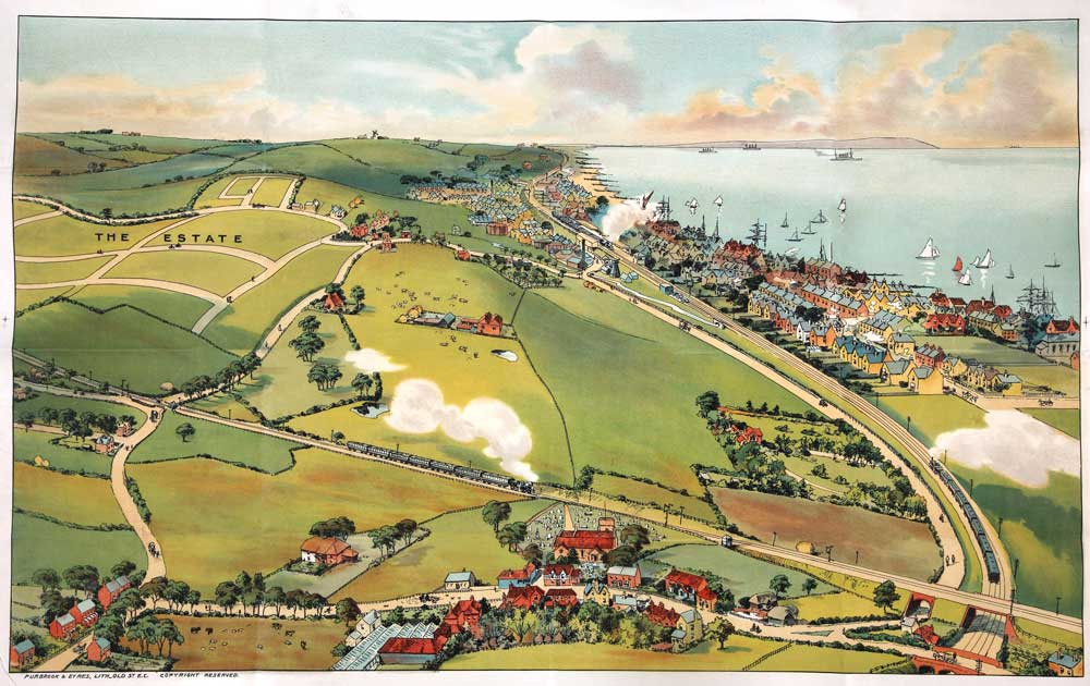
Whitstable, 1905. (catalogue reference: COPY 1/228 (98))
When I joined The National Archives back in July, the web team was already deep into redesigning the new website. One of my first tasks was to absorb all the brilliant work done by our User Experience team. Early feedback suggested the design could be more visual, but wherever possible we wanted to avoid trite stock images and sepia-tinted parchment. So early on we decided to showcase the many fascinating illustrations and photographs available in The National Archives’ Image library.
Like the new website, the imagery had to reflect The National Archives today and capture a certain type of ‘Britishness’ that would appeal to our many millions of users. A Britishness that’s proud of our heritage but not overtly jingoistic. A Britishness that’s curious about the past without being mawkish or indulgent. In addition we wanted images that would make you stop and think about the story behind them.
Luckily I had 40,000 images to choose from. Yes, you read that right: 40,000. That’s the number of images currently available in our Image library. That’s an astonishing number, especially when you consider the sheer diversity of the catalogue. From wartime propaganda to personal letters, advertising posters to political documents; for anyone looking for a unique visual record of Britain’s past it’s an amazing resource. If you have a moment take a look – you’ll be surprised at what you can find in there.
So, during our very hot and humid August, I began scanning through thousands of images, hunting for those that would take pride of place on the homepage, in Information management and in Education, all across the new website. Soon I found some real gems.

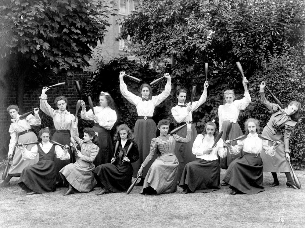
Gym class North Park College, Croydon, 1900. Catalogue reference: COPY 1/448 (243)
Isn’t that a great photograph? Any student, teacher or parent would empathise with these distracted Edwardian schoolgirls. Their expressions are priceless. Of all the education-themed images I looked at this one seemed to fit perfectly and set something of a benchmark for the other images on the new website.

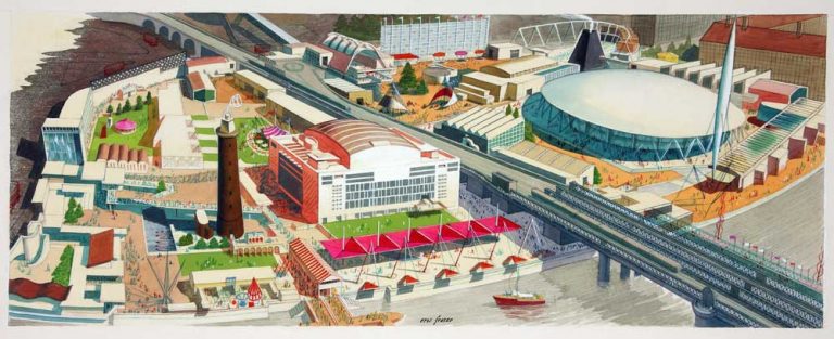
GEN-24 aerial sketch colour Artist Eric Fraser, 1948-1952. WORK 25/64-B1-SB
However, finding the right image wasn’t always so straightforward. The Archives sector proved particularly troublesome, and selecting an illustration that represented this multi-faceted section gave me something of a headache. In the end though I chose an aerial view of the Festival of Britain by Eric Fraser, a well-known Tolkein illustrator of dramatic and detailed compositions. While perhaps not an immediately obvious choice, this image seemed to fit the Archives sector, itself a celebration of archives and resources available to the public.

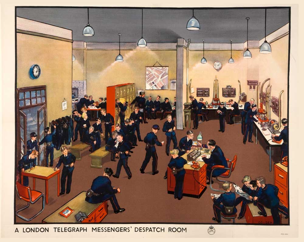
London Telegraph Messenger’s Despatch Room Artist Grace Golden, 1939-1945. INF 13/163 (13)
London artist Grace Golden features a lot on The National Archives’ website. There’s something infectious about her colourful paintings, bursting with activity and vivid historical detail. Take the image above from the Information management page. Here, we have a snapshot of a hectic day in the Post Office, with the messenger boys hard at work in post-war London. I love the details Grace Golden captured:the pneumatic message tube system on the walls; the boys reading the newspaper in the foreground or joking in the lockers at the back; the kettle on the fire, brewing tea.
Grace Golden was, by all accounts[ref]1. http://www.20thcenturylondon.org.uk/golden-grace[/ref], a remarkable woman. A writer and archivist with a love of theatre and dance she worked in the Central Office of Information and managed to forge a successful career at a time when commercial art was male-dominated. Ironically she thought illustration a lowly profession, once lamenting having to illustrate for Enid Blyton. You’ll find Grace Golden’s paintings featured on the homepage and in Information management. Her paintings are available to buy in the Image library.
The redesign of The National Archives’ website continues and we’ll be drawing further inspiration from the Image library, reflecting even more of our unique collection in the coming months.
As to that lovely image of Whitstable that graces The National Archives’ homepage, regretfully we know very little about the picture or the artist who painted it. So if anyone out there can shed light on this little mystery I’d love to hear from you in the comments.