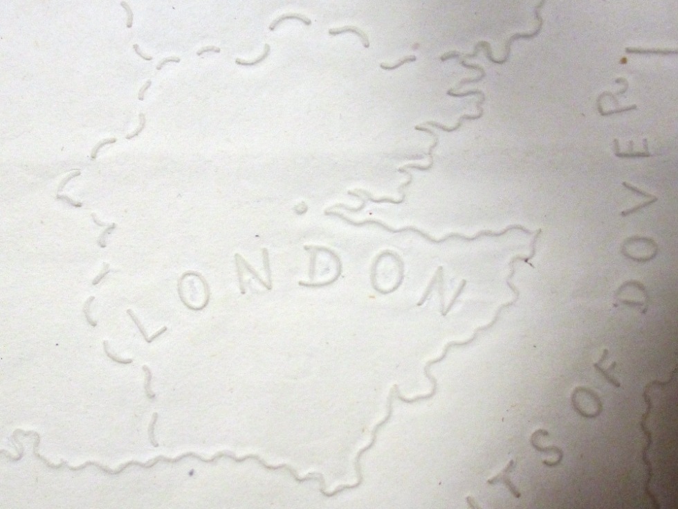
Detail from an embossed 'tactile' map printed at the Glasgow Asylum for the Blind, 1839, showing London (reference: MPI 1/63)
Like my colleague Jenni Orme, I’ve taken a lot of interest in the Paralympics and I was fortunate to get tickets for a few of the events, including my new favourite sport of goalball.
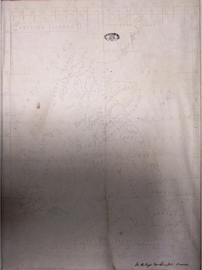
The whole map (reference: MPI 1/63)
Goalball is a team sport for blind and partially-sighted athletes. To allow athletes with different degrees of visual impairment to compete equally, all players wear blackout eyeshades and rely on their senses of hearing and touch when attacking and defending. As I am fond of saying, every story has its cartographic angle, and my enjoyment of goalball set me thinking about maps for people who cannot see.
Here at The National Archives, we hold two copies of what is thought to be the first ‘tactile’ map of Great Britain and Ireland made for the use of blind people. 1 Produced at the Glasgow Asylum for the Blind in 1839, the maps are made of thick paper with the lines and other details embossed so that they can be ‘seen’ by the reader’s fingertips. Although Braille had already been invented, it did not come into common use in the UK until later in the 19th century, so the text is written with raised versions of ordinary letters.
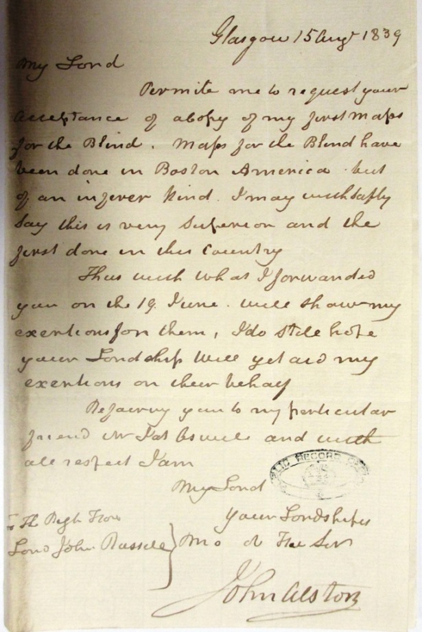
John Alston's letter to Lord John Russell, 15 August 1839 (reference: HO 102/47)
We hold these two maps because John Alston, the asylum’s director, sent them to London to draw the government’s attention to the work done by his organisation and to the difficulty and expense of producing books and similar materials for blind people. One copy is marked for the attention of Lord John Russell, Secretary of State for the Home Department, and the other for Fox Maule, the Under-Secretary. A bit of digging among Treasury records reveals that Mr Alston’s appeal to the government was quite successful. The Glasgow Asylum was awarded a grant of £400 towards printing bibles in raised type. 2
The maps were discovered in 1928 by one of my predecessors, who spotted them folded up within a bundle of Home Office correspondence relating to Scotland. 3 One of our conservators then constructed special cardboard frames for them so that they could safely be kept flat. A ‘dummy’ sheet in the related correspondence now marks the place where the maps used to be.
What I find most interesting about this map is what it does and does not show. For instance, the selection of towns and cities seems to be based more on what could easily be fitted in rather than their size or importance. For instance, Bristol is marked and named but Liverpool is not. The places selected to be shown are surrounded by rather arbitrary demarcation lines, presumably to help the user associate the place name with the dot marking the position of the town or city, but these could easily be mistaken for boundary lines.
If the date of 1839 was not marked on the map there would be few clues to the fact that it is meant to show the country in early Victorian times. It’s tempting to think that the map depicts a relatively idealised or ‘sanitised’ landscape from which traces of the industrial revolution, such as canals, newly-built railway lines and even the city of Manchester, have been erased, leaving behind historic medieval cities such as York and Norwich.
Maps like this one highlight the fact that anyone who designs, draws or otherwise creates a map has to make choices – sometimes quite difficult choices – about what to show and what not to show. A map showing too much detail, too little detail, or simply the wrong types of detail for its purpose is less useful and less usable than a well-designed map.
If you were making a map of the UK, what would you choose to put on it?
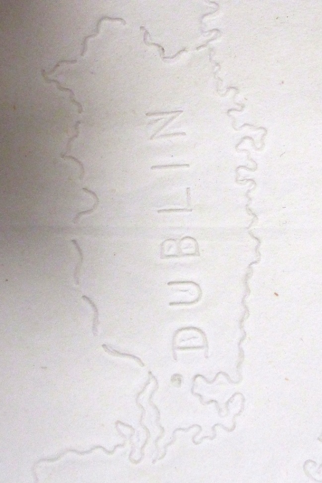
Detail from the map, showing Dublin. The dot marking the position of the city seems to be rather too far south (reference: MPI 1/63)
What next?
Learn more about maps at The National Archives.
Examine a loyal address to Queen Victoria on her Golden Jubilee in 1887, made by Liverpool School for the Indigent Blind (reference: PP 1/57/2).
Elsewhere on the web
Discover a whole atlas of the United States, published in 1837 for the New England Institute for the Education of the Blind, Boston, 4 on the David Rumsey website.
Find out more about modern tactile maps on the website of the Royal National Institute of Blind People.
Explore an online map of Paralympics GB medal winners created by Ordnance Survey.