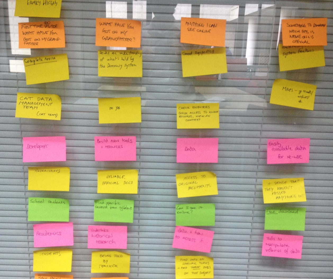
Post-it notes mapping out who our users are, and what they want
At The National Archives we work on a principle of user-centred design for our digital services. You may have read some blog posts recently about the different ways we do this by myself and my colleagues Emma and Maria. The principle is that the needs of the user are at the heart of the design process.
One of the most integral parts of user-centred design, is the design itself. You may think this is all complex coding, HTML and CSS for the techies to tackle. This isn’t always the case; a great way to solve problems and generate new ideas through design can be to bring it back to basics with the trusty felt-tip pen and paper. Technically called ‘lo-fi prototyping’ (and actually called drawing!), sketching out basic ideas is a fantastically simple and quick way to communicate new ideas with people (whilst at the same time being fun). A lot of time and effort goes into the design of our digital services, so from a designer’s point of view there is nothing worse than working on a clickable, fully designed prototype – only to be told by the likes of me that it doesn’t meet the requirements of our users.
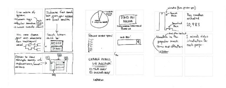
Sketching in action
We recently conducted some user testing sessions on a new part of Discovery, our catalogue, which is looking to integrate data from over 2,500 UK archives into the system. The testing was really insightful but threw up some interesting design challenges for us to think about and find solutions to what will become the world’s biggest archival resource.
To tackle this, a number of us from the project took part in a sketching workshop. What’s important to mention here is that no artistic skills are necessary when it comes to this activity (a good thing for me) – meaning that people from different teams across the organisation could take part.
Initially, we discussed the key issues from the user testing. We used post-it notes to map out who our different user groups are, and what tasks they want to complete when using our services. After that we got down to some sketching. It started with each of us designing a cereal box. What’s a cereal box got to do with The National Archives catalogue, I hear you say? Well, the task was to convey the proposition of Discovery on the front and back of a cereal box: what is it, what does it do and what are its unique selling points?
Once we’d got the creative juices flowing we then we each chose and sketched out six of the most important pieces of functionality we wanted Discovery to offer, always with reference to the results from the user testing. And finally, working in pairs we set about sketching out whole pages of Discovery. We had on screen the issues that we wanted to address as we were doing this. At the end, each duo presented their sketches and we discussed the similarities and differences and the ideas we wanted to take forward.
To some it may sound basic but this method this allowed us to work together to (literally) draw up solutions to problems, always based on feedback from our users. It allows people outside of the design team to get involved and share their ideas in a more creative way. The results from the sketching workshop were then fed back to the full design team to guide them on the formal designs. Once these designs have been created we will go back out and put them in front of users again to see how we do. And so the iterative cycle of user-centred design begins again!


Paul, thanks for sharing the experience, and the technique. Creative and useful! The notion of user centred design goes beyond the presentation of archival material, being applicable to all records managers.
Records managers spend a great deal of time (necessarily) thinking about issues like compliance and retention. But the primary value of records is, of course, their use in daily operations–which is where creative thinking about access and use from the business or operational user’s perspective can be valuable.
Also, congrats to you and everyone at The National Archives for being recognized as one of the top regional records management blogs of 2014 (details here: http://recordsmanagement.tab.com/records-management-2/top-records-and-information-management-blogs-part-4/). Nice work!