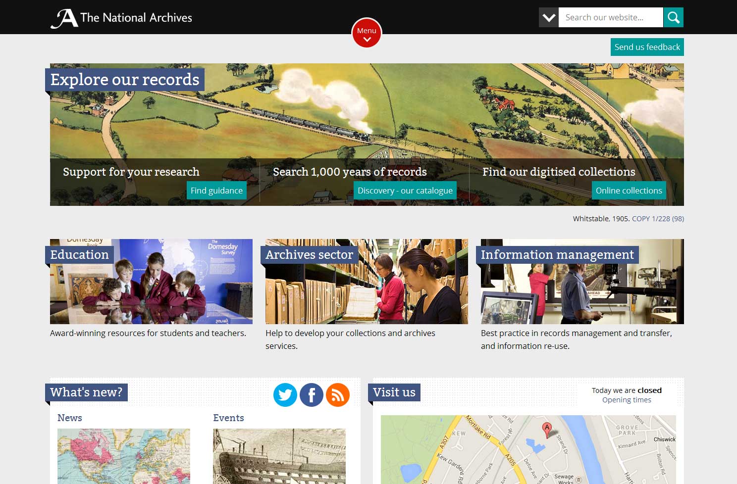
A few weeks ago Emma Allen wrote about the upcoming new design for our website. I’m delighted to be able to launch our first pages formally today.
This is the start of a refresh of all our digital services, and our commitment to putting creative-led design, coupled with user-centric methodologies, at the heart of what we do. The new design represents a shift in our thinking, and a shift in the changing needs of our audience. Mobile usage in the UK represents around 13% of internet traffic.[ref]1. Source: http://gs.statcounter.com/#mobile_vs_desktop-GB-monthly-201211-201211-bar, September 2013 [/ref] Mobile traffic to our own web services greatly exceeds this at a shade under 20%.[ref]2. Source: WebTrends, August 2013[/ref] On the face of it, this might seem surprising, and not what some might expect from an audience of archive users, but then archives today are far removed from the popular trope of dusty buildings and forgotten collections.
The process has been a rapid one – a little less than five months from initial ideas through to launch – in which we’ve challenged our own thinking and stretched ourselves creatively. It hasn’t just been about making a website that works well on mobiles. We’ve looked at every element of design, from layout and imagery through to colour and typography, and honed and refined these until they best meet your needs. There has been no place for ego. Some beautiful ideas and concepts have been sacrificed along the way as they simply haven’t added value for you. Using records from our own collection in a bold and, we hope, beautiful way, we’re also trying to broaden understanding of what we hold.
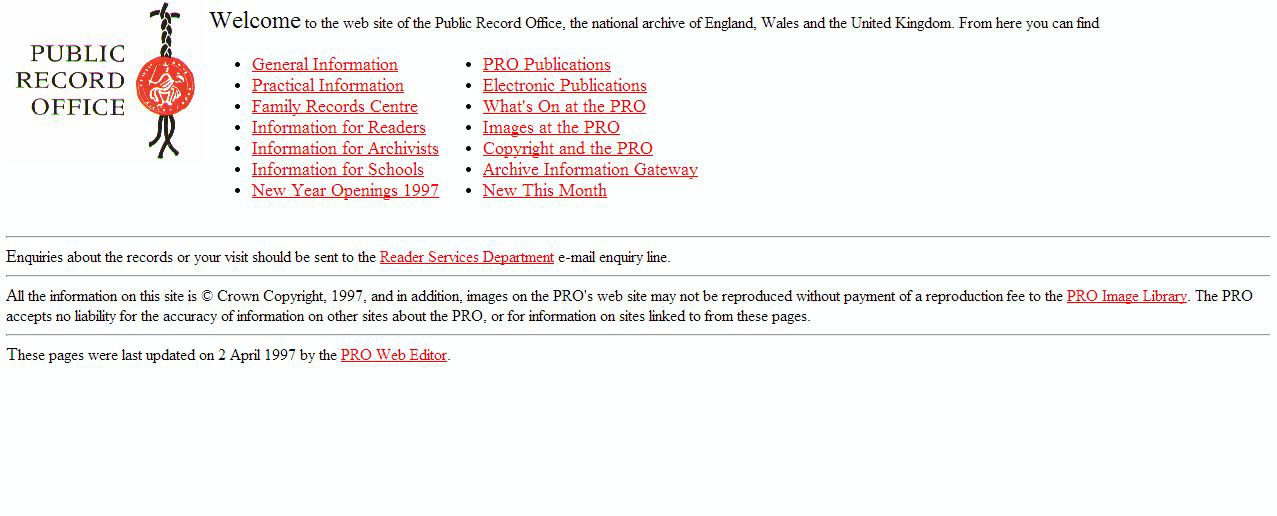
I would argue that this approach – one of innovation, user-led, guardian of the record – has been a common theme of The National Archives, and its precursors, including the Public Record Office, over the years. The 1995 Keeper’s Report states with pride, that: ‘early in 1995, the Office [sic] set up a home page on the Central Computer and Telecommunications Agency (CCTA) government website to provide general information about the Office’. Sadly, we don’t have a copy in our web archive, but you can see our website from 1997 onwards on Pinterest.
When you look back at the design of our website over the past 16 years, you will see not only how much web design has moved on, but also how much our organisation has too. I hope you will agree.
Try out the new pages today and let us know what you think via the feedback tab, or comments below.

