Ok, so the title is just a hook, I actually disagree with the part about children. Let me explain…
Here, at The National Archives, we’re currently redesigning the Education section of our website, so who better to ask about the new design than the children (and teachers) that will be using it.
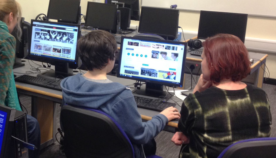
Ladened with iPads, laptops, sharpies and lots of post-it notes, a group of us visited two very different schools – Our Lady of Victories, a Catholic primary school in Putney and The City of London independent day school for boys aged 10-18, near Blackfriars.
Being aware of how little time teachers and students can spare, the sessions we carried out took no longer than 30 minutes. We user-tested the younger students in pairs, in case they felt nervous and rather than ask too many formal tasks we had a general chat about how they would use the site, what they liked, disliked and whether the information they found was what they expected.
We made it clear that there were no right or wrong answers and just observed the way they interacted with our new site. We also asked them to say out loud any thoughts that crossed their minds whilst using the site.
“I like the pictures”
“Where are the games?”
“How do I make this image bigger?”
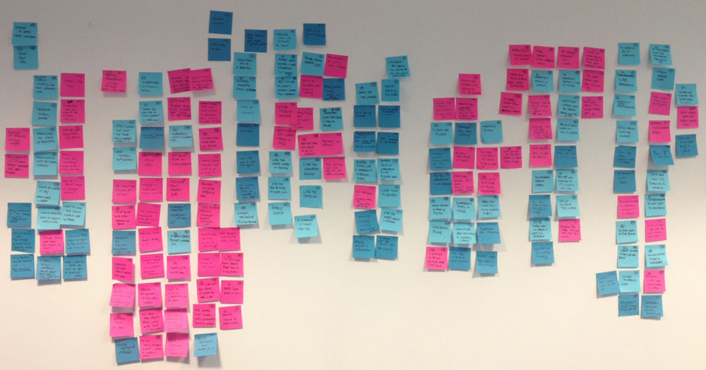
We captured their feedback by noting down all the good and bad points on different coloured post-it notes. Then, upon our return to the office, we stuck all the post-it notes up on a wall, grouped them together under various categories such as ‘navigation’, ‘functionality’, ‘content’ and ‘labelling’. Then Paul, our User Experience Manager, analysed them and created a summary of actions for the team to address.
It may seem like common sense, but by speaking to users of our site, it just reinforces the fact that we need to keep our web pages intuitive, consistent and most of all simple.
Watching how children use the internet is fascinating, mainly because it seems like second nature to them, they don’t hold back with their opinions or worry they may offend.
Kids like pictures, colours and games and teachers need to get to the right information easily and quickly. They don’t want to trawl through a mountain of information.
Sometimes, I think we get too close to a project or a design and user testing allows us to stop, step back and look at what we’ve created through someone else’s eyes. Having others point out the obvious really does help.
On Monday 31 March 2014 we’ll be releasing our newly designed Education site as ‘beta’. This means it will be available for you to try out, before we replace our live pages.
If you would like to take part in future testing of our online products and services or would just like to give some general feedback, please let us know by commenting below.
Personally, I found the user testing sessions we did with children hugely insightful and fun, so thank you to all those who took part. As for user testing our website with animals… who knows what the future holds.


We would be happy to help with future testing.
St Mary’s & St Peter’s Primary School
Teddington
TW11 8RX
Thanks Deirdre, we’ll be in touch soon…
A great blog post- have shared it.