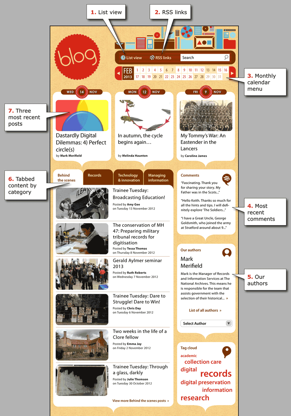
It’s been a very exciting 2012 for The National Archives’ blog. Since our very first post, back in February, we’ve endeavoured to involve you in the extraordinary range of work we do here, and share the passion and enthusiasm our bloggers have for their work. Through comments, tweets and emails, we’ve had brilliant feedback from you, our readers, and hope to build on this success into 2013.
We’re currently posting about four blog posts a week (sometimes more, rarely less), and try to make sure that these cover a variety of subjects. The classic blog ‘list view’ (showing in date order) does mean, however, that posts are quickly pushed quite far down the ‘front page’ of the blog.
So, in time for our first birthday in February 2013, we want to launch a new front page for the blog, one that lets us keep a lot more posts visible on your screen, without you having to work to get to them. You will still be able to switch to the current list style by clicking on ‘List view’ at the top of the page (click on the image on the right to enlarge it).
Based on feedback from contributors we also want to simplify our categories. But we want to make sure that these will make sense and be useful to you, the readers. You can still search by keywords, or use the tag cloud to find specific posts. The new categories are: Behind the scenes; Records; Innovation and technology; and Managing information.
Please take a look at the mock up of how we think it could work. The point is very much to make the blog easier and more enjoyable to use. Your comments and feedback on posts are what make the blog so valuable (and fun) to us here, so if it doesn’t work for you, it won’t work for us. This is still a work in progress – if there’s anything you just can’t believe we haven’t thought of then please do let us know via the comments below, or by emailing us. Also, if you love the new layout, we’ll be happy to hear that too!
So from everyone on the blog team: admin, designers and contributors, thank you all for sticking with us so far, and we hope to hear a lot more from you soon.
Merry Christmas and a Happy New Year!

I think the mock up looks very nice. My only comment (which is improved by the mock up, but fundamentally not fixed), is that the National Archives headers and the very large graphics at the top of the blog itself take up almost the entire vertical space on the screen. And I’m looking at the blog on a screen substantially taller than most short (errr.. wide) screens in use today.
The blog graphics are very pretty, although I have no idea what they have to do with a blog – they seem to be a representation of different media on which information might be stored.
Personally, I prefer a cleaner look and feel that doesn’t waste so much precious vertical space. The big static, non functional graphics look so 1990s…!
Thanks very much for your comment Matt. The header is something we’re reviewing as part of the re-design – for the mock up we left it as is as we wanted the focus to be on the new category structure/navigation, but I should have made this clear in the accompanying text.
I really like the design for the new blog layout and like how the three most recent posts remain visible for longer. The calendar menu is nice but I wonder if there is more value in something closer to the current ‘History’ panel as you also get a count of all the posts in a particular month.
From a reader/professional interest perspective I feel it might be a shame to lose a handful of categories and wonder if there isn’t room for one more – something which could encapsulate the work of Digital Preservation, Web Archiving, and Collection Care which often crosses boundaries between practical application, theory and research.
Apart from that, awesome stuff, keep up the good work!
Hi Ross – we’re still looking at the best way for the calendar to work. One possibility we’re looking at is that clicking on a date brings up a preview of that day’s blog post(s), but it is very much under review at the moment.
Regarding categories, trying to find titles that will make categorisation both simple and helpful to archives users, casual browsers and professionals/specialists has been a bit of a struggle. However, our current list is unwieldy, and tags/search should and could be doing the job of finding very specific subjects. I appreciate the justification behind another category, but with ‘just one more’, if not 5, then why not 6? and so on, and then we’re back to where we started. But if you can think of better labelling for the categories, then please do send it in!
We do really appreciate the feedback though, so thank you! And I will be taking it to the blog team and we’ll see what our designer can come up with.
Cheers,
Ruth
One suggestion that’s come out of my recent post is a “print friendly” view to make it easier to share posts with less web-savvy members of the family.