The Records section of our website, along with Discovery, our catalogue, is at the heart of most research here. Among the most popular resources are the research guides, written and designed to help researchers, whether family historians or academics, to find and interpret what they are looking for.
Finding the right guide for your research is not always easy and this redesign project aims to provide people with clear routes in so that they can get the help they need with their research.
We wanted to bring the design of site up to date and make it usable no matter what device you are using, ranging from smartphone to smart TV. People looking at our website using mobile devices increased by 15% in 2014 and we need to make sure that our users have a good experience no matter what device they use.

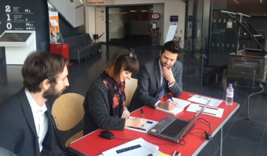
User testing in Bristol
User research
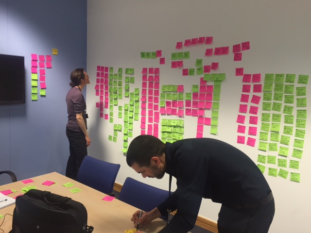
Before we delve in to the detail of what and why we’ve changed things, one of the first things to mention is the user centred approach we undertake for all our digital products. The aim is to ensure that our users’ needs are at the core of what we do. Due to the ambitions of this project, we wanted to be sure we knew who our users are before we embarked on working out their needs. The first step was to go through all our previous user research and redevelop our personas. The purpose of personas is to create reliable and realistic representations of your key audience for reference within the project team and organisation wide. That way we’re clear that we’re not designing for us but for our user group. We updated the personas with staff from across the organisation in a series of interactive workshops.
We have carried out different forms of research throughout the project. We:
- sought feedback through an online exercise testing labels and headings
- sought feedback from visitors in our reading rooms showing them prototypes of the new designs
- spent a day speaking to members of the public in a cafe to get feedback from non-users of the site
- ran online surveys and used web analytics for more quantitative insights into how people use our website
- ran one to one, hour long sessions in London and Bristol with our users showing them the new designs, recruiting to our personas to ensure we spoke to the right people. We observed and listened as the participants carried out tasks and gave their feedback.
We then took all this feedback, analysed it and made changes to finalise the new pages for release in beta.
I’d like to say a big thank you to those at the Bristol M Shed who let us carry out some of the research in their building. It’s really important we get the views of those outside of London where visiting The National Archives is less of an option.
The main changes
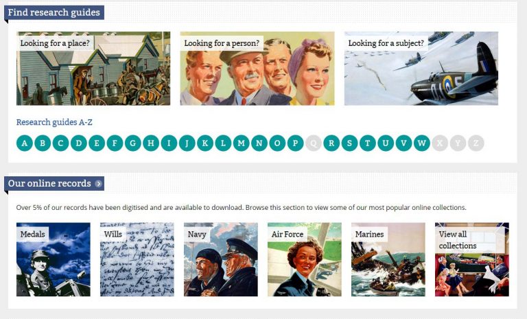
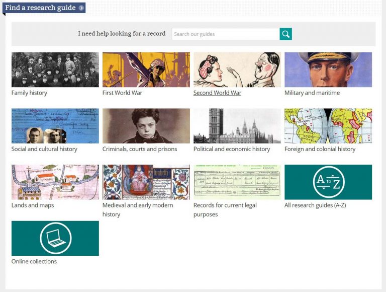
The new-look Records pages, now entitled ‘Help with your research’, presents the user with a completely different set of options for finding guides which will be helpful to them. Gone are the ‘Person’, ‘Place’, ‘Subject’ categories, replaced by eleven new categories, the smallest number of meaningful categories into which we felt our research guides could be grouped. With categories like ‘First World War’, ‘Family history’ and ‘Foreign and colonial history’, users should now have a better sense of where to go for the records advice they need. We had regularly observed our users struggling to use the ‘person’ ‘place’ and ‘subject’ routes and often found that what they were presented with did not meet their expectations. The user research we undertook during the project showed a very positive reaction to the new categories and users were able to clearly identify a route in, whatever their task. Additionally, the new headings helped shaped their expectations so it was clear they were looking at research guides.
The new categories should appeal to a broader set of users and provide a route in for researchers at any level, whatever your task. You can see these changes in the screenshot of the current Records site and the screenshot of the beta version of Help with your research below:
Guides now appear in multiple categories, allowing for the different ways in which researchers think about what they are doing. Similarly as before, but in an improved format, there are several ways that you can find the right guide: by selecting categories, keywords or searching the text of the guides themselves. We’ve also presented the things we know that people look for within each category by highlighting the most popular guides.
The guides themselves look different too. At the top of each guide is our new ‘access indicator’, a visual key to how the records covered in each guide can be viewed, something often misunderstood in the past. Our research showed that this information was really important to our users; knowing whether something is available online or not has a big impact on people’s research. Related guides are more prominently displayed and they have a more uniform look and design, with the several different types of guides all brought together under the same webpage.
We’ve also made the pages responsive to any device. What this means is that whatever device your looking at the website on, be it a smartphone, tablet, laptop or desktop, the pages will respond accordingly and ensure a good experience.
While we have started with the over 300 research guides, we will continue to add the few remaining pages from this section into beta over the coming months.
Working collaboratively
The project benefitted hugely from the collaborative way in which it was carried out. The Web Team, responsible for designing and looking after the website itself, and a broad cross-section of the Advice and Records Knowledge department (ARK), who provide the historical knowledge and public enquiries staff at The National Archives, combined their expertise in the hope that we would cover all angles. It proved to be a very fruitful collaboration, with both sets of staff well versed in what users of the website want and need.
ARK staff, with their records expertise and the benefits of their daily contact with the public, suggested the guidance categories and sub-categories they felt people were most likely to identify with and which best represented the broad subject areas most popular with researchers of all kinds. The Web Team found the best way to present these categories on the website, making navigation to them and between them as easy as possible.
Staff were involved in much of the user research, getting involved, running and observing some of the sessions we ran. For example, we streamed some of the user testing sessions live to one of our conference rooms and it was great to see the room packed out with colleagues observing and discussing the sessions. It’s a really great way to ensure we all have a good understanding of our users and what’s working well and not so well.
Your feedback
We’d like to make sure that we listen to your feedback and keep evaluating the new designs during the beta phase to ensure that we’re continuing to meet users’ needs. We’re releasing the pages in beta which means that we’re releasing a working version for the public to use and give feedback on. It’s the last stage before we release it live. We will keep evaluating the changes and make amendments based on what people tell us. There may be some things which aren’t fully working and there may be some bits that are broken. It is our chance to iron any issues out. Have a look through the beta version and leave your feedback in the comments below. Tell us what you like, don’t like and how you think we can improve. We’d be really keen to hear what you think so that we get this as right as we can.


[…] The National Archives has been working on a project to redesign their research guides and give them a more user centred approach. More about this work can be found in their blog http://blog.nationalarchives.gov.uk/blog/help-research-website-redesign/ […]
[…] find out more about the redesign process, and to let us know what you think, read our blog post and leave comments in the comments section […]
I confess to listening with horror at the recent AFFHO Congress in Canberra when Roger Kershaw advised this change was imminent – one of the reasons being that the current entry to the guides is too “text heavy”. Well, I for one, found it extremely easy to use, to click on, e.g. “Looking for a Person” and then scanning through the guides available in different categories – all listed on the ONE PAGE! In general, I find the move to using picture icons as entry points to be “dumbing down” (NB: I don’t use a tablet and still prefer a mouse with my laptop – admittedly something of a dinosaur in this respect).
However – I have just had a look at the beta version of entry to the guides and am pleasantly surprised. I think it will work well and be widely acceptable. The obvious showing on each guide of record availability should be easily understood by all.
Thanks for the feedback Sylvia. Glad to hear you think the new design works well and that the access indicator will be easily understood. We hope very much that we are not dumbing down and are as resistant to that idea as you are. The challenge for us is to find a way of presenting information so that it works for all kinds of users, whether first-time visitors to our site or experienced researchers who have been using our website for years. We hope that our new set of categories strikes this balance.
Love the categories. I asked Ancestry to do that years ago…glad someone is. That said, WOW, everyone on your categories are caucasian! Since I am caucasian but my children are asian I find this somewhat problematic. You might want to make your people look more like the people I see everyday in my life and on the street!
Thanks for the feedback Cheryl. We will be reviewing the images before we launch the new design on the main website and will certainly bear your comments in mind.
Whilst this is an improvement, the main problem are the lack of Research Guides, there is none for Treasury after 1920 and the Second World War are big issues. I do find it strange to say the least that the section on ‘Towns and Cities’ does not mention Treasury records at all, Treasury approved the loan sanctions and funding for local government since the 19th century and I assume that TNA know that.
It is a pity that TNA did not ask people who have experience for their input before going through this project.
Thanks for the feedback David. The focus for this project was primarily layout and design, rather than content. New research guide titles were not, therefore, within our remit. That said, we are always open to considering new guides, particularly if there is sufficient demand for subjects or types of records which require greater guidance than Discovery alone can offer.
A significant number of experienced users were consulted throughout this project and we hope this is reflected in some of the design elements, including a more comprehensive set of categories, some of which should, we hope, resonate with that type of user. The categories will be reviewed before we launch the new design on the main website and we will bear in mind your suggestion that the Treasury guide be included under ‘Towns and cities’.
I understand the need to move to a responsive design, but so far I can see nothing else to recommend the change in the couple of research guides I’ve seen in Beta (the pre and post 1558 chancery equity suits guides).
Whilst one expects that things may not work properly in a Beta version, it seem a little strange that there is no ready means of reporting errors from the pages. In the pre 1558 guide there were words that had helpful explanations when you hovered over them – this is now broken, there is some odd formatting and the explanations seem to be missing.
You claim the responsive design “ensure a good experience” on all devices. I am pleased that on my widescreen the text (in blocks) is less than half the width, but it is hardly good when tables remain narrow as well, while over half my screen is blank. A good experience would be them responding to the available screen width. But it’s not a big deal.
Worse is the footnotes that instead of being full table width as in the old version are now in col. 1 so yet more scrolling is needed (on top of the extra required by the large text now used). (see http://www.nationalarchives.gov.uk/beta/help-with-your-research/research-guides/chancery-equity-suits-after-1558/ , table in section 2.2)
Unless you have a large screen you will now need to scroll to see the note that applies to what you are reading – definitely a worse experience than in the old version. I hope this is something that will be fixed (if combining table cells is a problem in the design why not show the notes below the table?)
But redesigning the site at this time seems a bit of fiddling while Rome burns. Far more important to me than a responsive design is that these guides are kept up-to-date and working properly. I am afraid that since the incorporation of the A2A data the links many of the links in the Chancery equity suits research guides give crazy results. There are now lots of refs with C9 or C13 or whatever, the links need to point to the appropriate info.
As it is, you need to be an experienced user to know how to find it. Surely it would have been better to finish one thing, the A2A change, before embarking on another.
And, as I said, the guide is out of date. C7 is now searchable online, and the index to disputed wills is online at FMP (and was before on Origins) where it can be searched by plaintiffs and defendants names (last name only) as well as by testator.
(There may well be other things out-of-date in these guides, I just happened to notice these; I see the notes on the page about C7 are up-to-date; shouldn’t the guide be updated at the same time?)
All this said, I am aware of these issues because I find the guides so useful so thank you for them and the detailed advice in them.
Lastly, because I find them useful I have a number of book marks to various research guies; I hope the pages will retain their current urls, or you create forwarders so these don’t all break.
Thanks for the feedback Teresa. I’m sorry to hear you have found a number of errors in the guides to Chancery equity suits. We are aware that the moving of all guides to a new template has thrown up some formatting errors and we are in the process of tidying up the guides whilst they are on Beta so that hopefully we have addressed these problems by the time we launch the new designs on the main website. This tidying up will ensure that the links lead to the relevant results. You should already find that the glossary terms have been restored and that most if not all of the links now make sense. I see what you mean about the footnotes under the tables and we will look at improving this.
Updating this guide is very much on our agenda so thank you for your comments regarding some of the changes needed – these will be useful when we review the content of this guide in the near future.
Finally, a reassurance that your bookmarks should still work as we will have redirects in place from the old URLs to the new ones.
I know that you have a great deal of information about my ancestors held at Kew which is not available unless I pay a large fee or make a personal visit to London. I do so wish that you could begin on the task of digitalising all your records to make them available to people like me. I know this is an enormous task which will take years but it would encourage amateur family historians like myself who are unable to travel to London to remain committed to their research. As the main source centre for family history research, I would also like to see the National Archives bring rules to bear on regional archives who are currently too lacking in resources and not very forthcoming with access to the records they hold. Regional archives also should begin to digitalise their resources.
Thanks for the feedback Jan. We have been digitising our vast collection for a good number of years now, with over 9 million records now available for download. There remains, however, a large and expanding number of digitisation projects in the pipeline. As you rightly point out, getting our records online is an enormous task. Digitisation projects are expensive and time consuming and whilst we remain committed to opening up our collection to everybody, wherever they live, through digitisation, there are no short cuts and we will doubtless be digitising for years to come.
[…] our last blog post about the website redesign, we have carried on redesigning our website section by section. More recently, our developers have […]